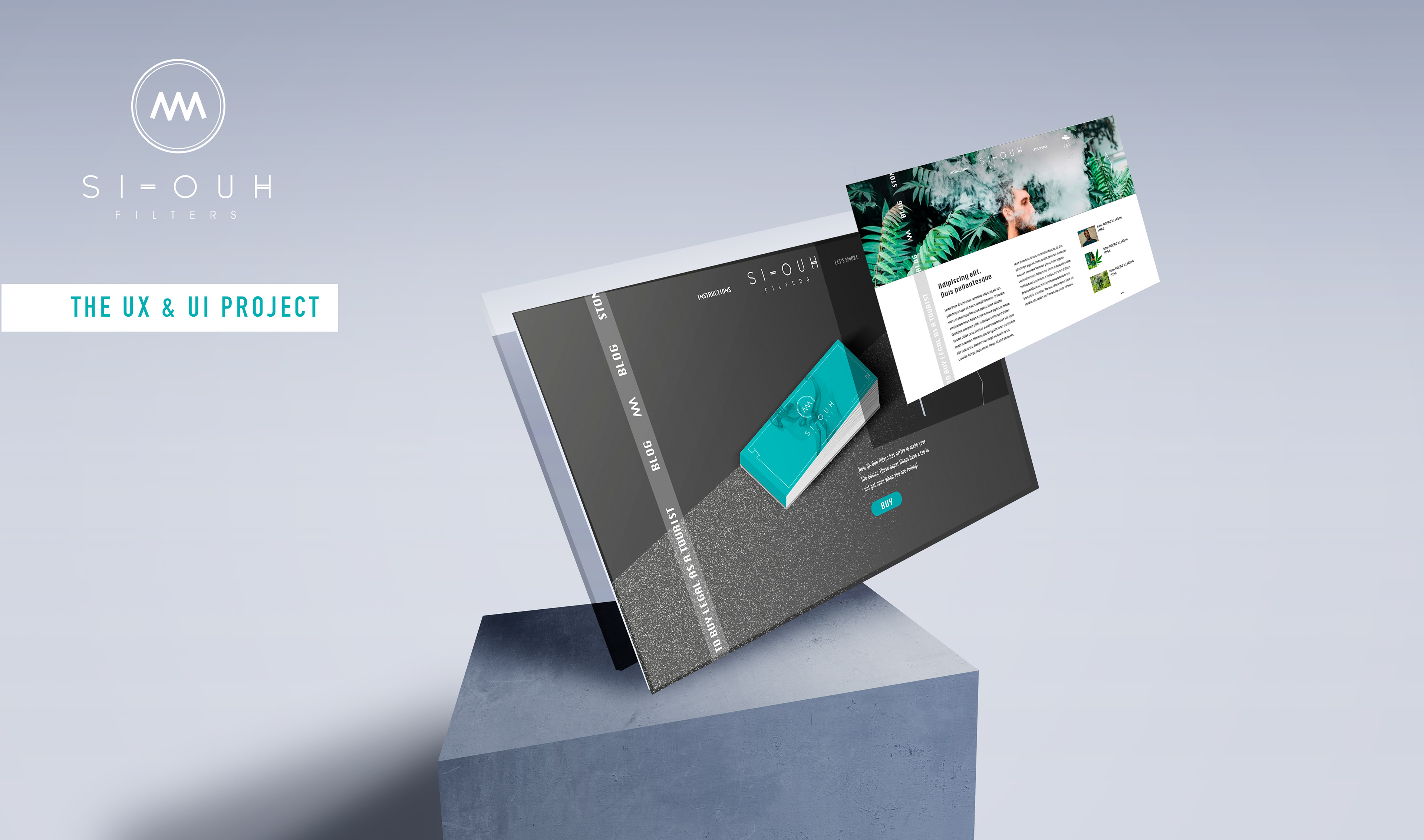
PROJECT INTRODUCTION
SI Ouh filters ("See Ou", reading it) is a self project , in which we have carried out the creation of the product, naming, design, brand visual identity, communication images, experience research and UI design.
It was born as a product improvement for the typical smoking paper filter tips. With a cool brand, direct, modern and honest, which normalizes and updates the new profile of smokers.
THE CHALLENGE
Create a website aligned to the product, talking the same language, and be the platform to introduce the product in the market and sell it.
USER EXPERIENCE RESEARCH
I started my research making an hypothesis of my target, defining it. In this case the product had defined their own target, but I had to double check if it is same target online and offline or if there are any difference.
TARGET USERS
I interviewed smokers 20 years of age or older. Who smoke socially and solo.
They would also be people who value quality and usually smoke well known brands. Open to trends, they value the experience of smoking as a special moment.
INITIAL HYPOTHESIS
Our main target are grown adults, +25 years old.
People who love to smoke, look for a valuable experience, not only for the fact of smoking.
People who love to smoke, look for a valuable experience, not only for the fact of smoking.
People who smoke, would be happy to engage with a brand for smokers.
Choose their affinity brands and styles.
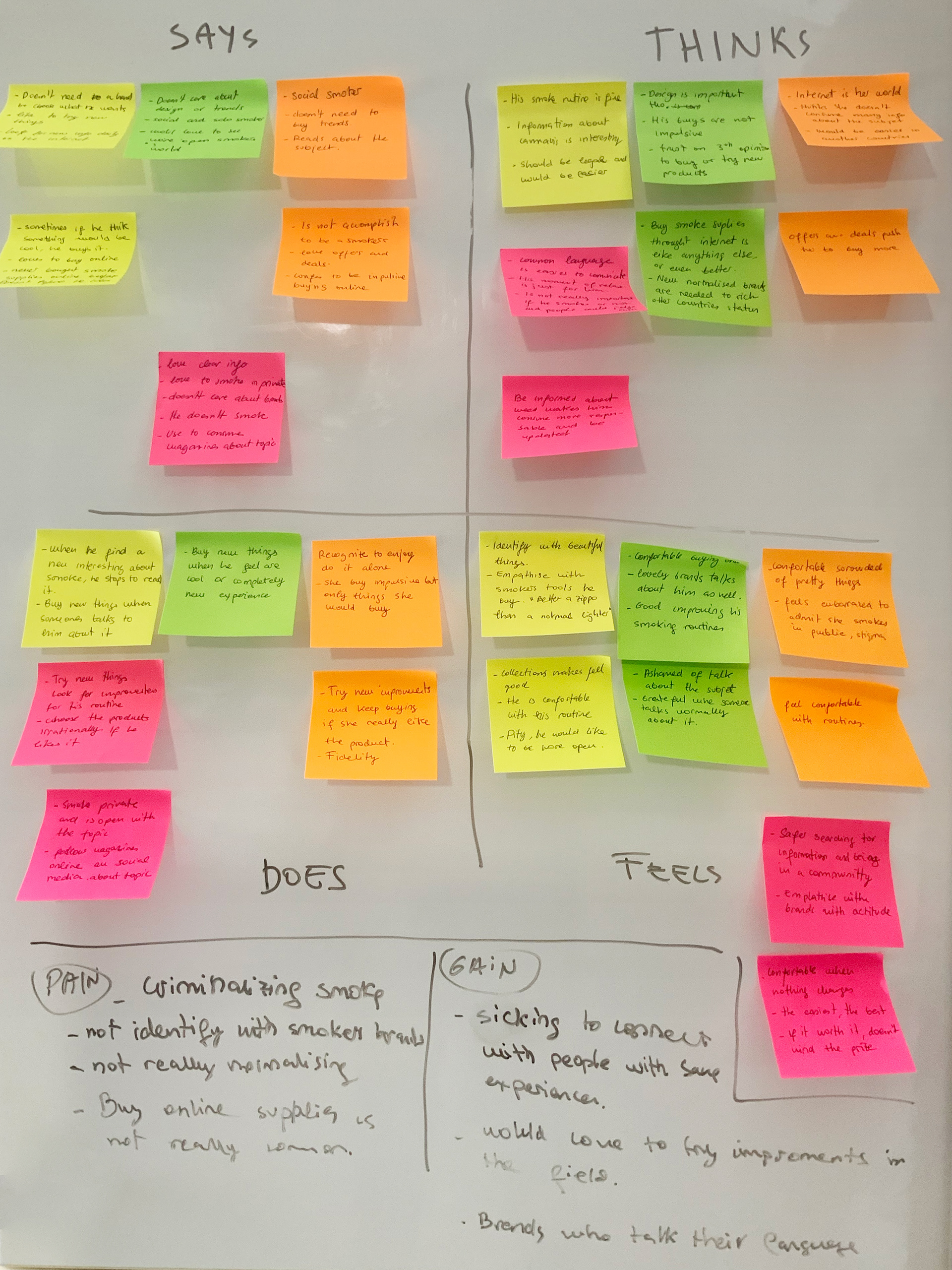
USERS FEEDBACK SUMMARY
- Even though almost no one is openly a smoker they all follow smokers related accounts and they are smokers' information consumers.
- They feel social pressure.
- They don't say their decisions are based on irrational but they buy impulsively if they like the esthetics and if they feel a connection with the brand.
- Average open-minded.
CONCLUSIONS
The hypothesis had been proved because we are going to be focus on quality. Being unique but cool and setting trend on the "smokers world"
Our website should break the social stigma with smokers. It has to be simple, free, cool, smart, and rebel.
The hypothesis had been proved because we are going to be focus on quality. Being unique but cool and setting trend on the "smokers world"
Our website should break the social stigma with smokers. It has to be simple, free, cool, smart, and rebel.
This research helped me to define a persona.
PERSONA & SCENARIO

RECOMMENDATION JOURNEY MAP
As we start from scratch, I came up with an ideal journey map for the users.
Thinking in the goals we want to achieve in each step.

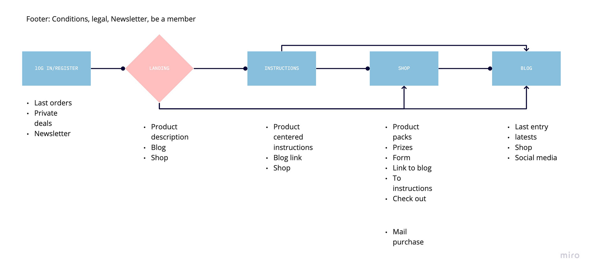
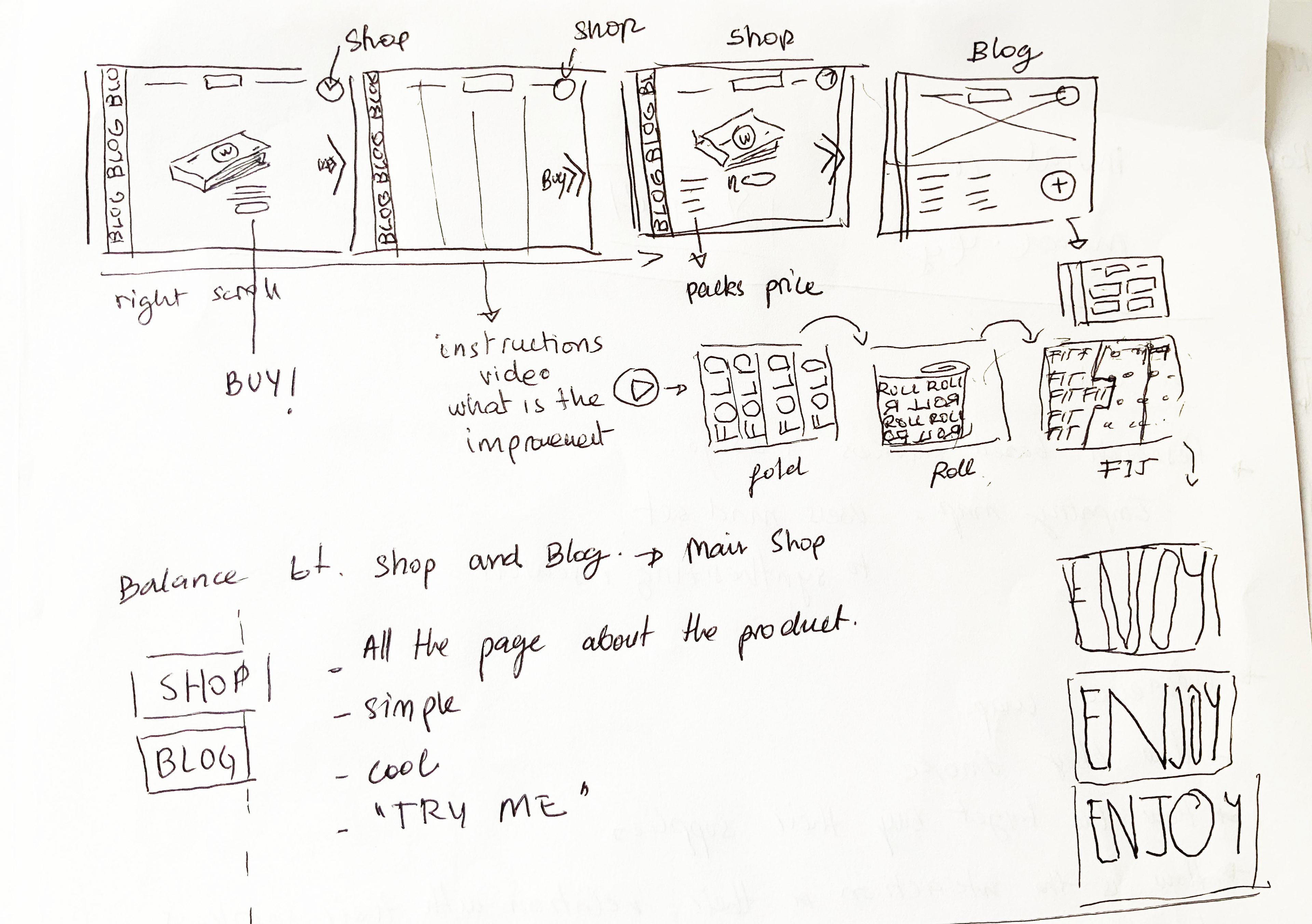
SITE MAP
At this point, I started working on different site flows. And coming up with the right site map.
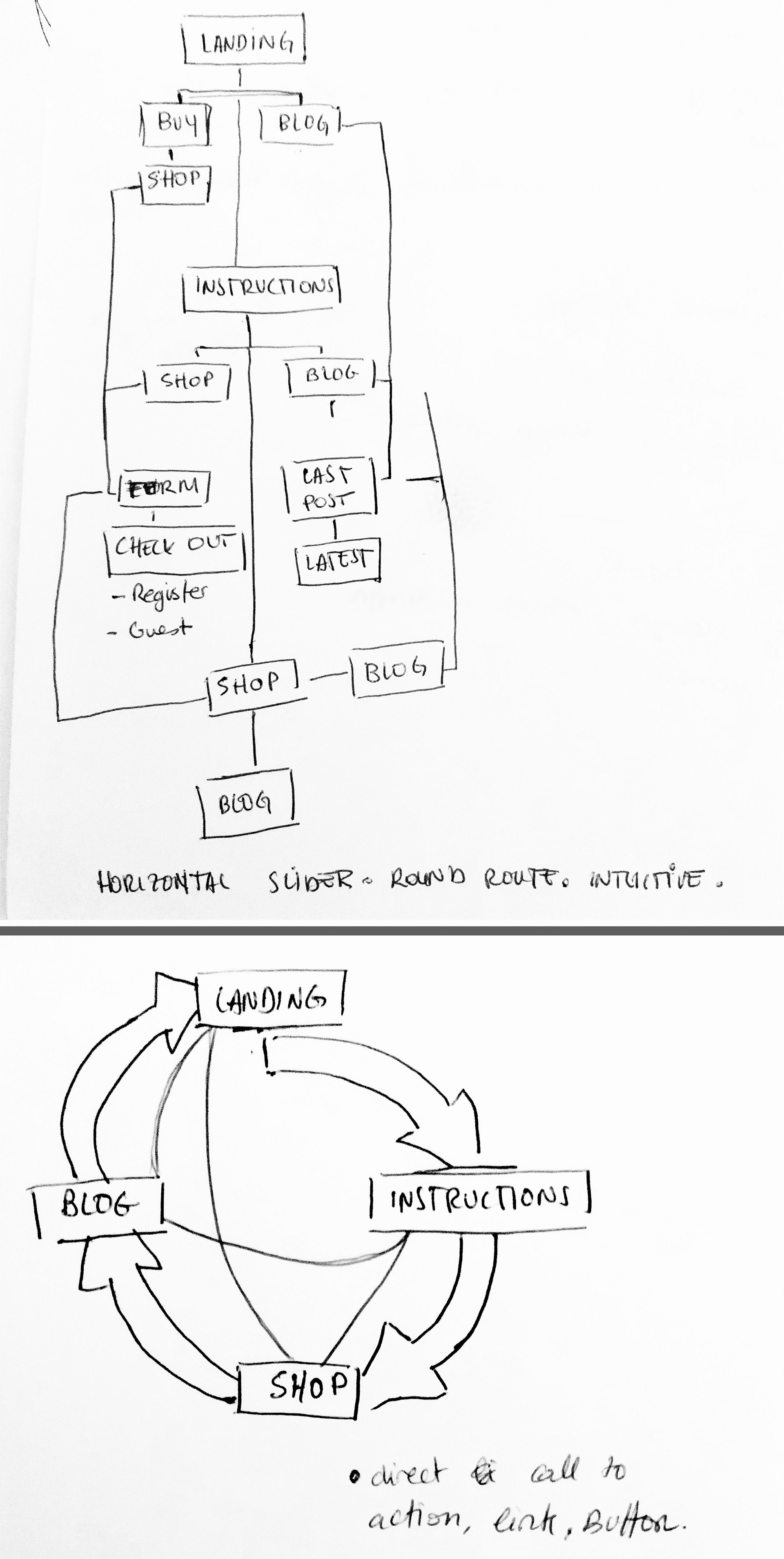
First attempts of site map. Figuring out the path the users will go through.
DESIGN STUDIO
I collaborated with a studio, we exchanged ideas on how to implement the prototype, I focused on the following:
Developing solutions for the How Might We statements.
Create visual elements to help user goals.
Making it easy and very visual.
Reaching the shop without effort.
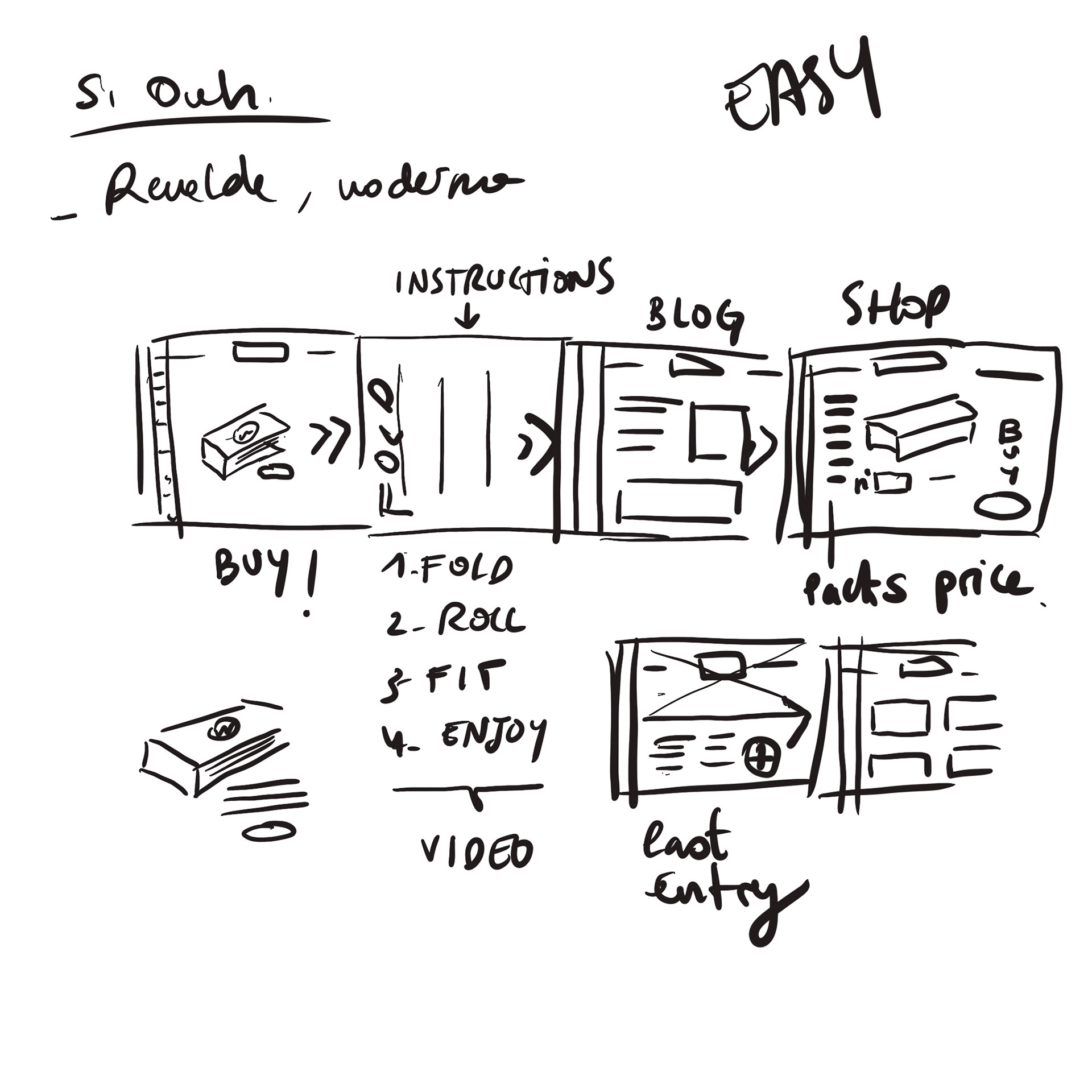
Sketches following the site map I came up with, implementing the ideas of the design studio.
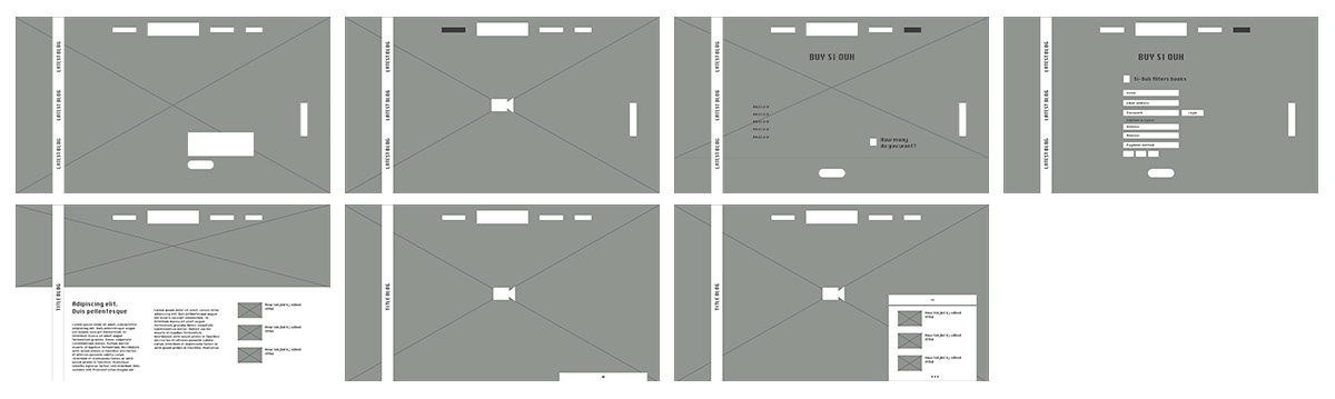
MID-FI WIREFRAMES
For this stage I collaborated with another design studio to be able to gain a different perspective. We focused on developing the ideas I’d come up with.
MOOD BOARD
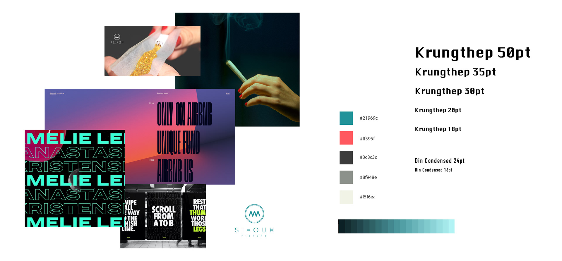
I used Krungthep font for text highlights because is a bold font, very impactful, more geometric that gives an aspect more technologic and direct. Also is part of the Adobe fonts catalog, easier to implement.
And the brand font, Din Condensed, more elegant and light. URW DIN, Adobe fonts.
The main colors contrast, grey and white makes it fully accesible.
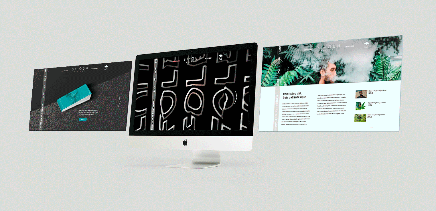
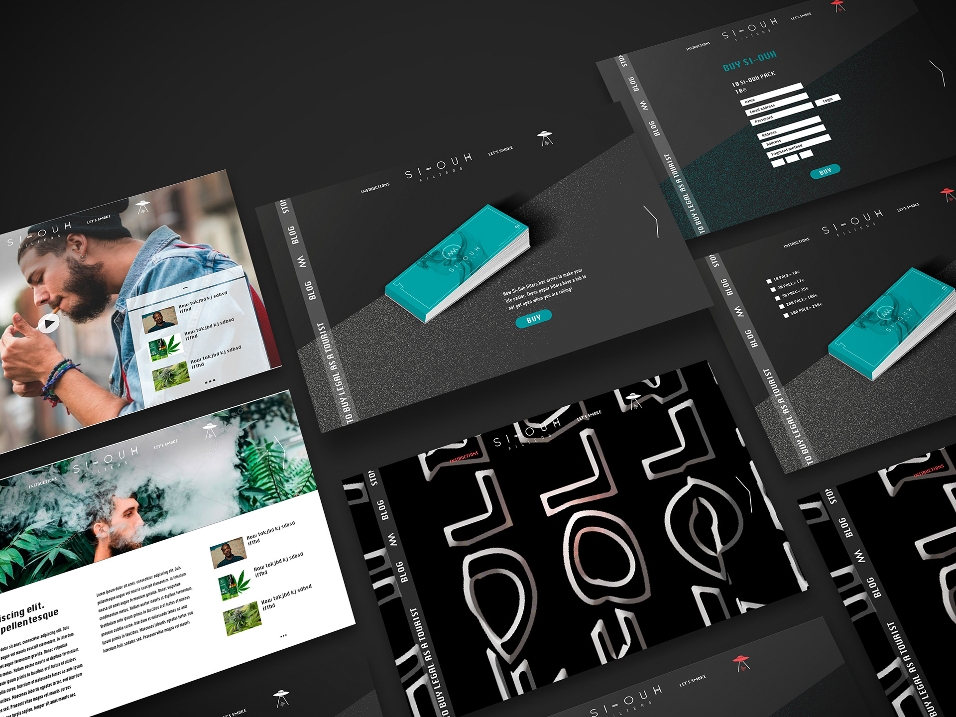
FINAL DESIGN AND MOCKUPS
THOUGHTS AFTER THE PROCESS
To create a digital product for a brand that you already know is a challenge. Be impartial, and try to discover something new. Keep being open-minded and see it as white paper it is a must exercise.
- Researching online and offline habits are key to build a successful product.
- Journey mapping is a crucial part of the UX process and it helps to inform wireframes and other work that follows.
- Keep the language aligned with the brand, also making it understandable and accessible.
- Researching online and offline habits are key to build a successful product.
- Journey mapping is a crucial part of the UX process and it helps to inform wireframes and other work that follows.
- Keep the language aligned with the brand, also making it understandable and accessible.
THE BRANDING PROJECT

A NEW PRODUCT
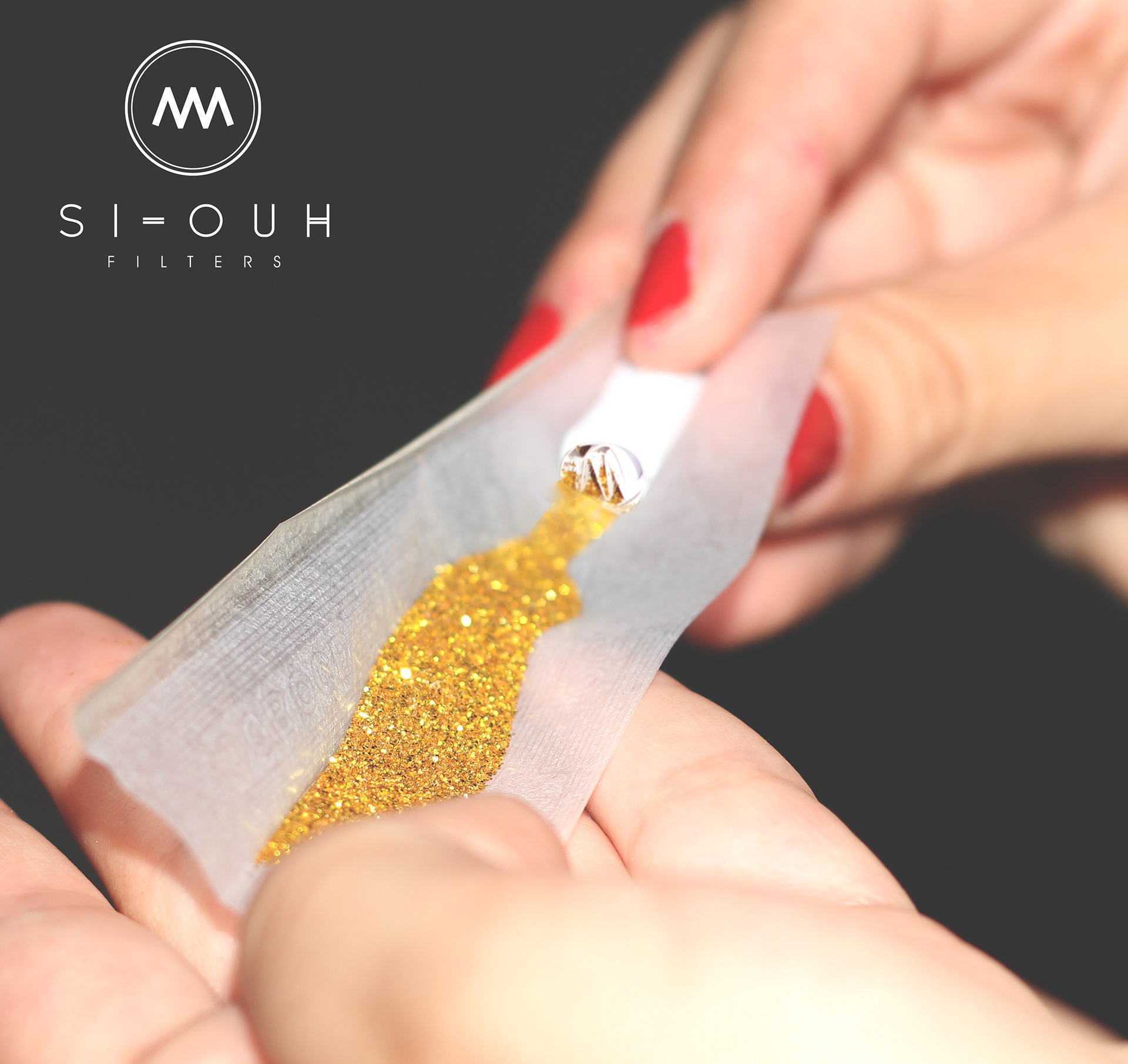
The filter tips have a tab to fit them so they do not get open when you are rolling it.

LOGO IDEA AND DESIGN
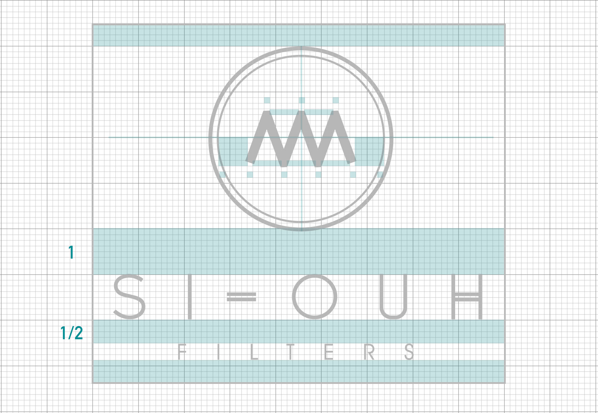
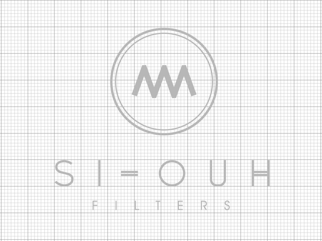
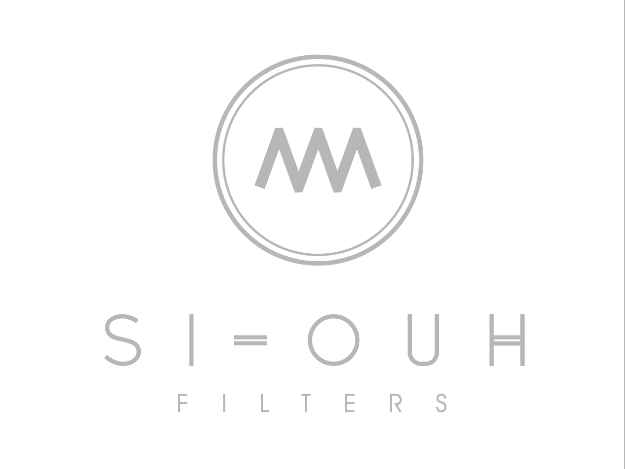
LOGO IMAGE, ICON AND DETAIL
Different applicatIons of the logo brand

PAPER APPLICATIONS
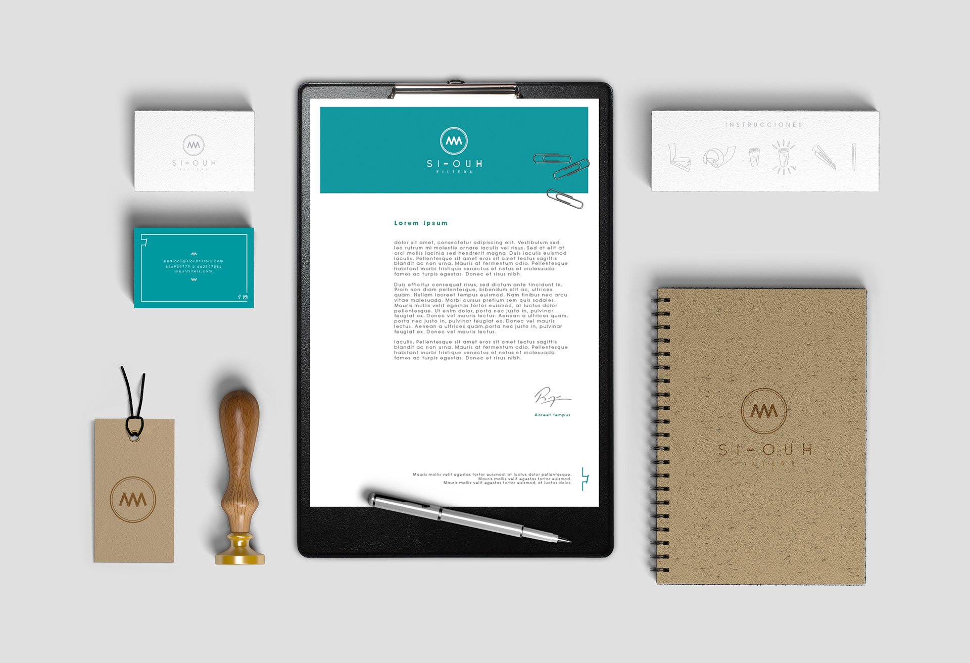
Examples of paper application for the brand.
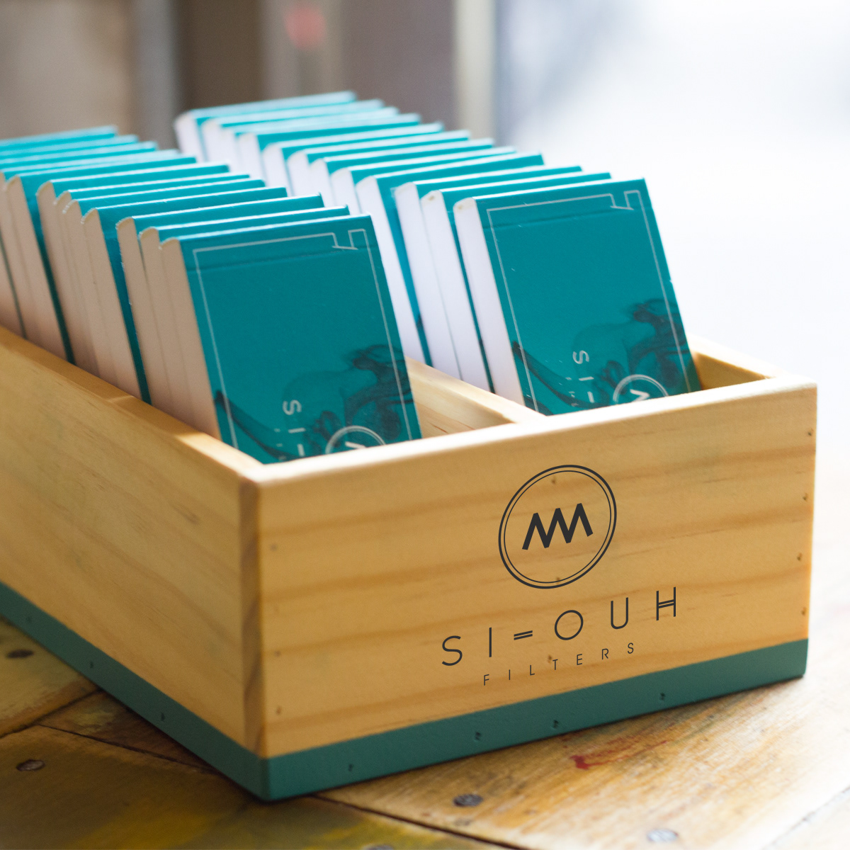
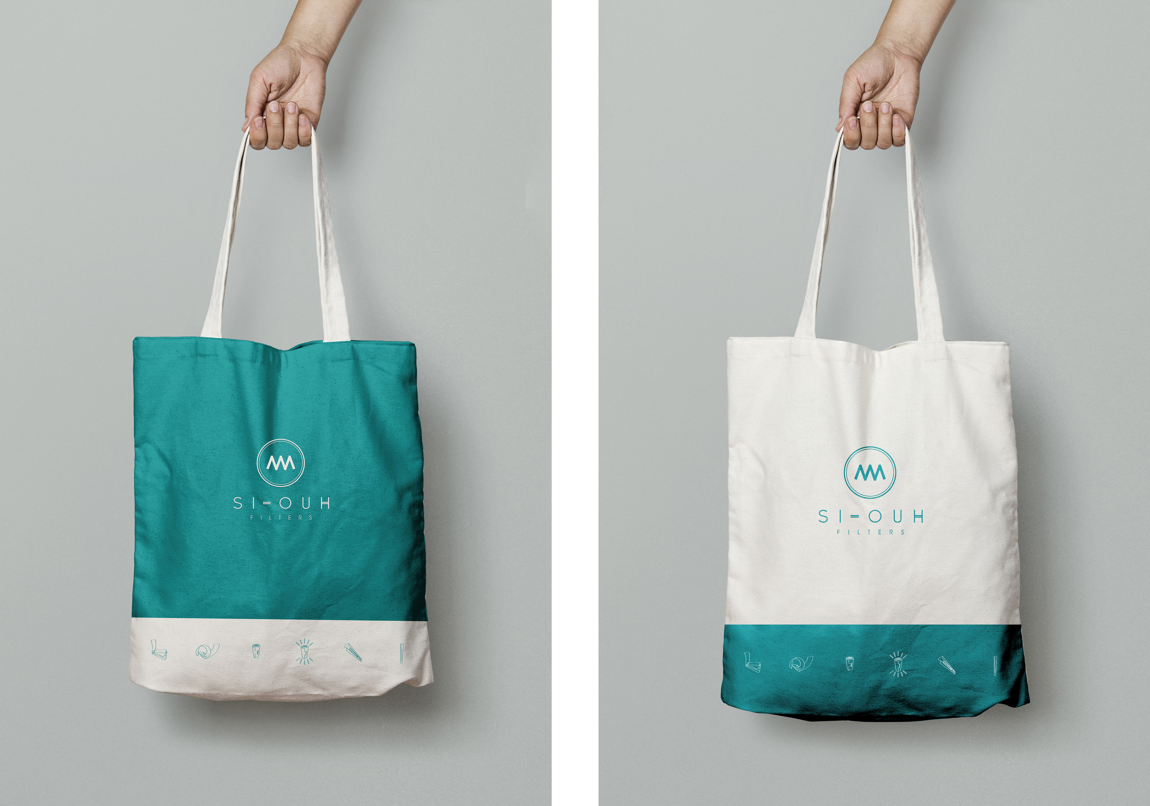
MERCHANDISIGN

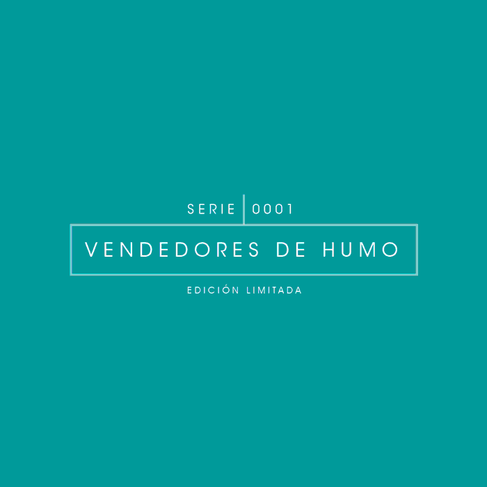
FIRST EDITION DESIGN
Each edition of Si Ouh filters is thematic and follow a concept. This first one is called "Smoke sellers"
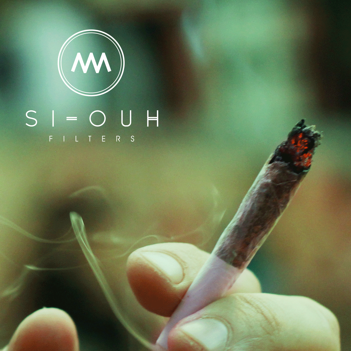
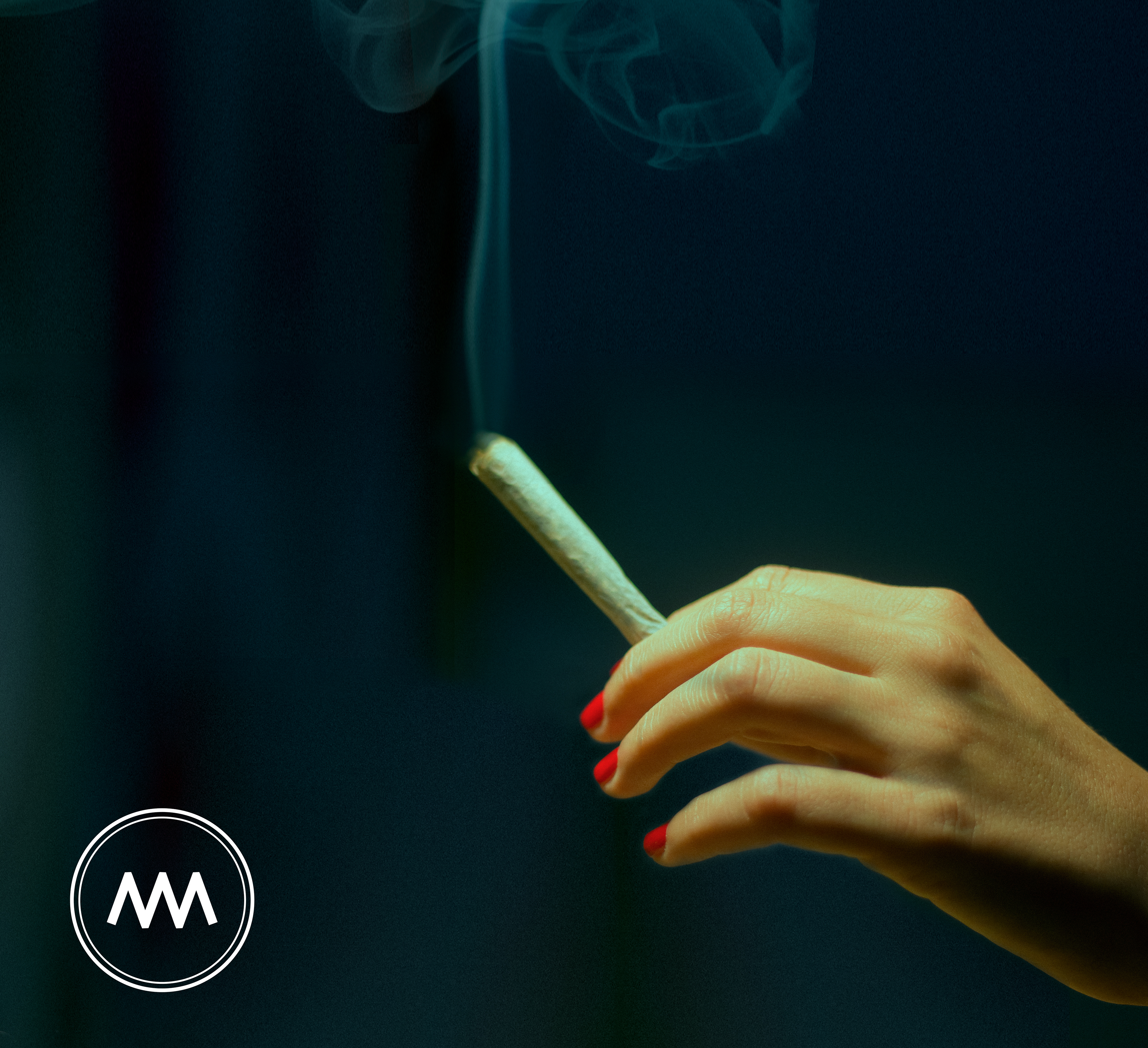
COMMUNICATION IMAGES
These are examples of photographies, and social media images that I created for the brand.