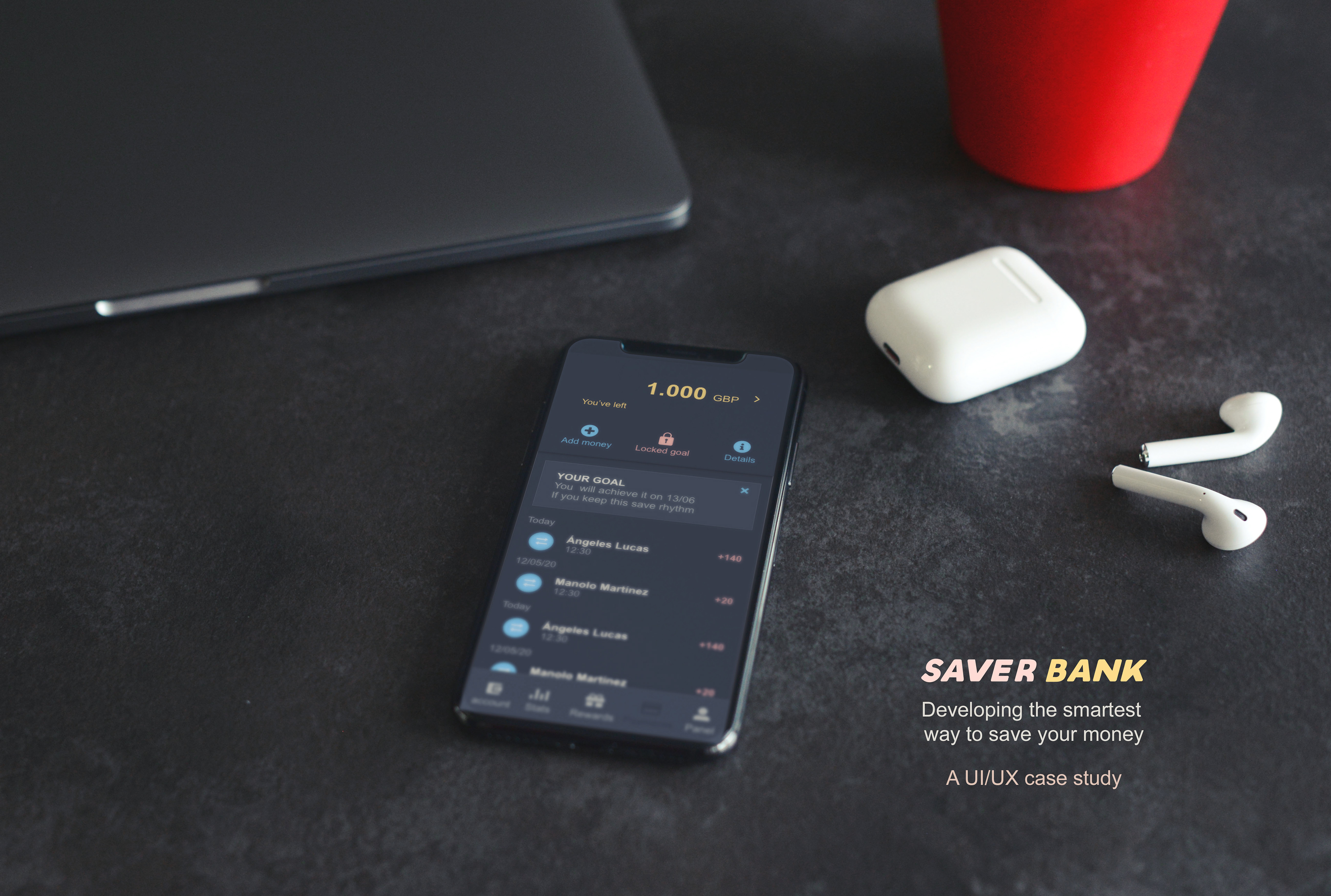
PROJECT INTRODUCTION
A UX/UI project, developing a new app to save your money.
To save is very important for all of us. But everyone save for a reason, holidays, dentist, college... there are plenty of good reasons to do it and also many different ways. No matters how, but everyone struggles to do it, so I decided to create Saver Bank, a new account without cards, without permanency, but with little goals to keep you constant saving, and be rewarded for it.
THE OPPORTUNITY
To create a project that little savers, and not that little ones, would love. An account only dedicated to saving your money, without cards, with your money available at every time and giving to you a %APR interests, the longer you keep saving and keeping your own goals, the higher % you get.
MY ROLE
Creative, UX & UI designer
PROJECT SOCPE
Creative: - Conception, ideation, brand design
UX designer: - User interviews, persona creation, user story creation, user flow, wireframes
UI designer: - Mood board, style guide, visual design, mock ups
HOW IT WORKS
TARGET USERS
I interviewed 2 different kinds of users, based on their traits.
- Little savers. People who are interested in saving money. Who is concern every month to save part of their salary or even set goals to achieve.
- Parents who have children with saving accounts or who want to teach their kids saving.
- Little savers. People who are interested in saving money. Who is concern every month to save part of their salary or even set goals to achieve.
- Parents who have children with saving accounts or who want to teach their kids saving.
INITIAL HYPOTHESIS
This is a product for "little savers", this means middle to middle high-class people who like to have some extra money, usually for extras.
-These people would love to have more clear information and a bank that encourages and reward them for saving rather than just keep their money locked.
- It Is easier to save if you have goals for your savings and rewards from your bank.
- Credit and debit cards, are enemies when you try to keep your money in your account.
AFFINITY MAP BASED ON THE INTERVIEWS
-When I first started I found that there are different kinds of savers, they save in many different ways. I identified them and tried to discover if this fact makes any difference in their behavior and could be meaningful to represent different target users.
I elaborated an affinity map to rich what they really have in common and how this app would help them to achieve their goals.
I elaborated an affinity map to rich what they really have in common and how this app would help them to achieve their goals.
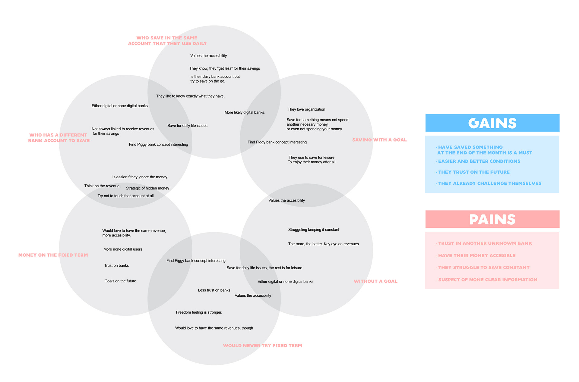
USERS FEEDBACK INTERVIEWS
All users were interested in the piggy bank concept, but more the parents who want their kids save.
The Little saver users, liked the idea to have their money available but without temptations like credit cards.
Keep a rhythm saving is important for both of them, Little savers and parents.
Both targets really liked the idea to be rewarded by the bank for their money saved.
ANALYSIS
Despite I found more different ways to save than I defined at the beginning, I proved they all are little savers, as I defined on my target.
The app should be clear and trustable.
Should only be for saving. No cards, no distractions. As I said on my hypothesis, this was proved.
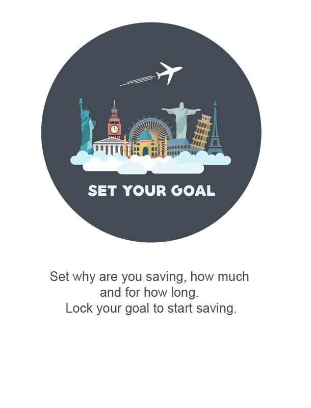
As I suggested on the hypothesis, the app must work by goals.
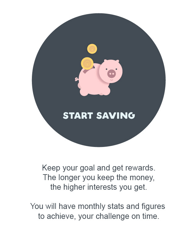
And the user should be rewarded, the longer the user keep their goal, the higher reward. (Reward on % APR, depending on the market)
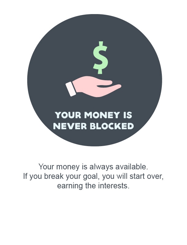
They will never lose money. Only start over to "earn their reward".
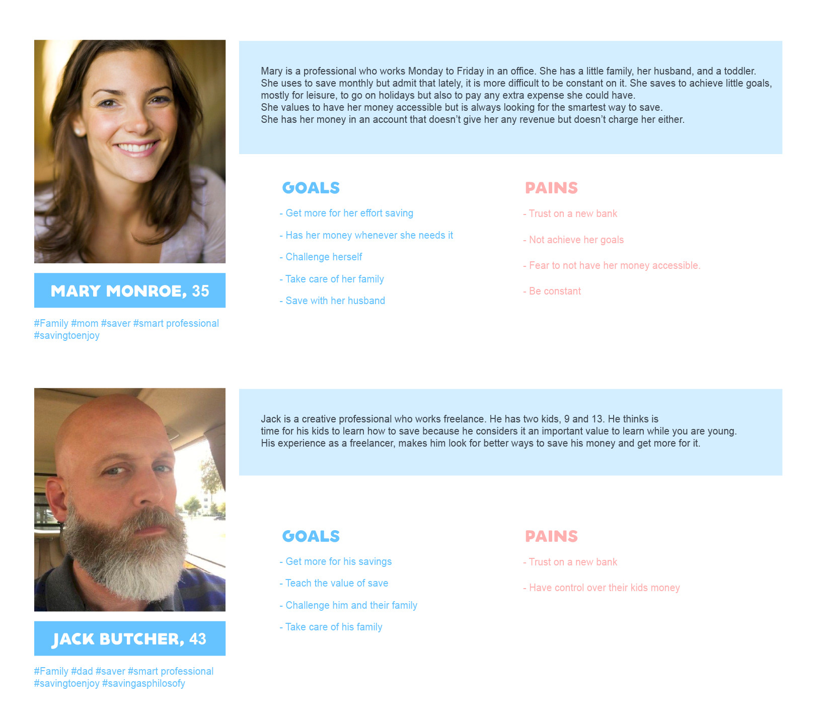
PERSONAS & SCENARIOS
SITEMAP
I started sketching the site map for the app.
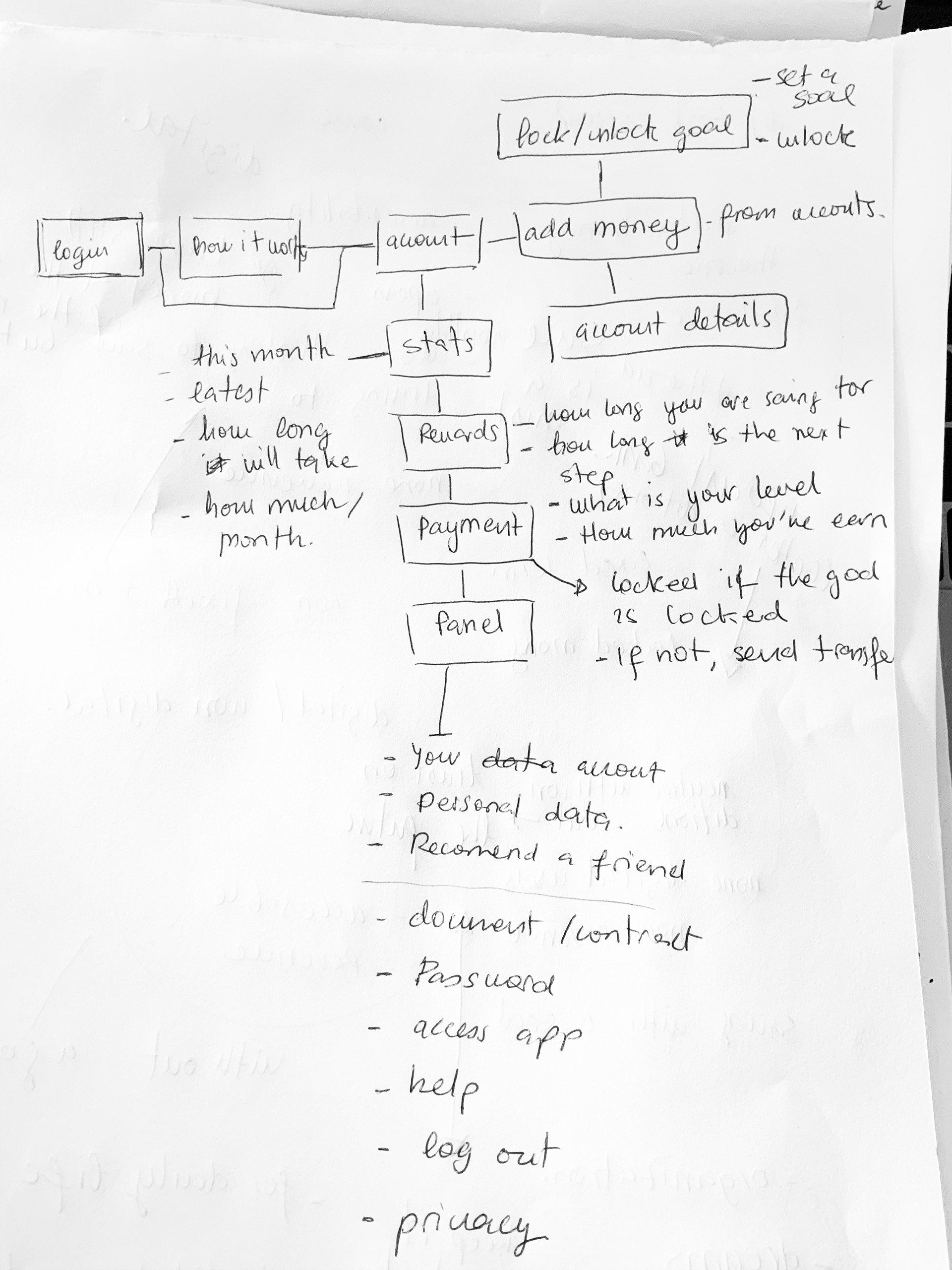
Site map first studios
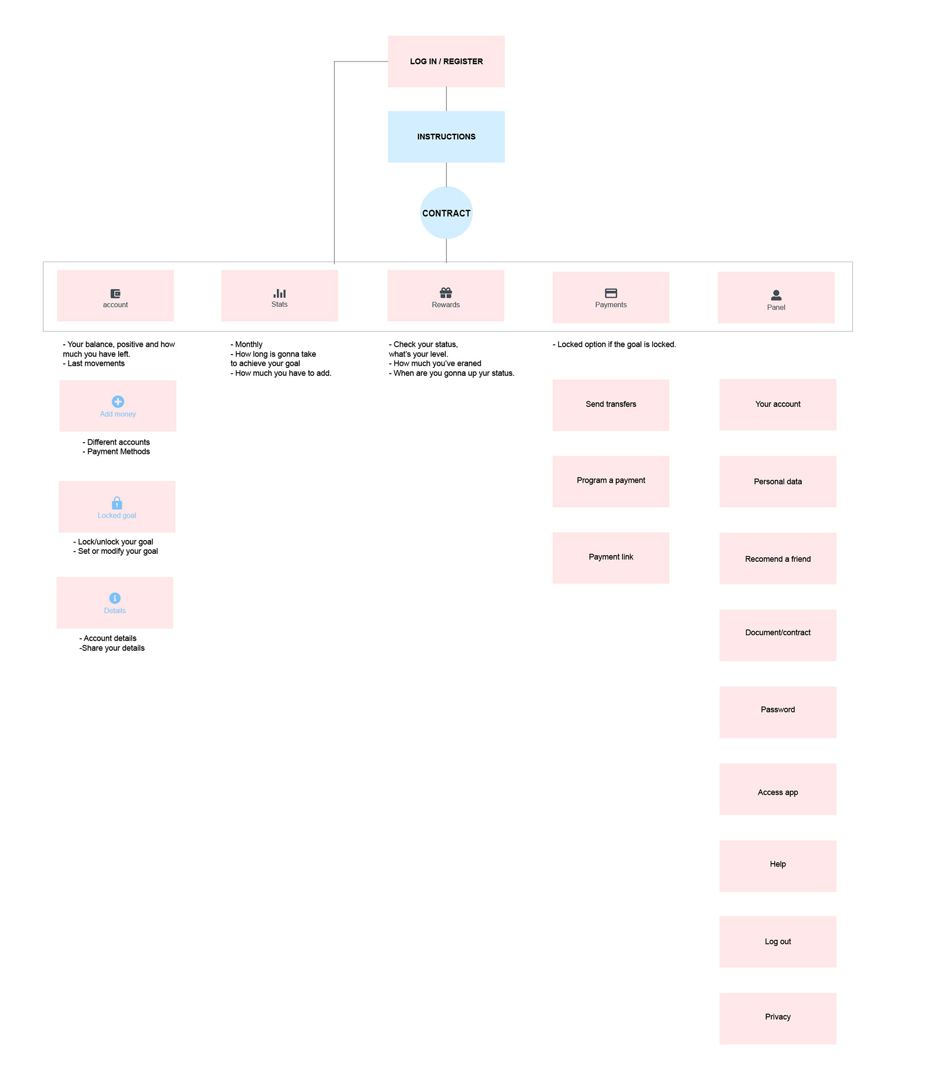
coming up with the right site map. Always looking for an efficient flow
First sketches of prototyping. Focus on the visual side.
DESIGN STUDIO
I conducted a design studio which helped me to come up with the main ideas that I was going to implement in the prototype. I focused on the following:
Developing solutions for the How Might We statements.
Visual elements to help user goals.
Making it easy to use and available for all kind of saver
Keep things clear to help with trust issues.
Ways of making users be constant saving.
A second design studio was conducted focusing on the ideas I came up with, in the first design studio. The main goal was to focus on how these features and ideas would be implemented visually in the app.
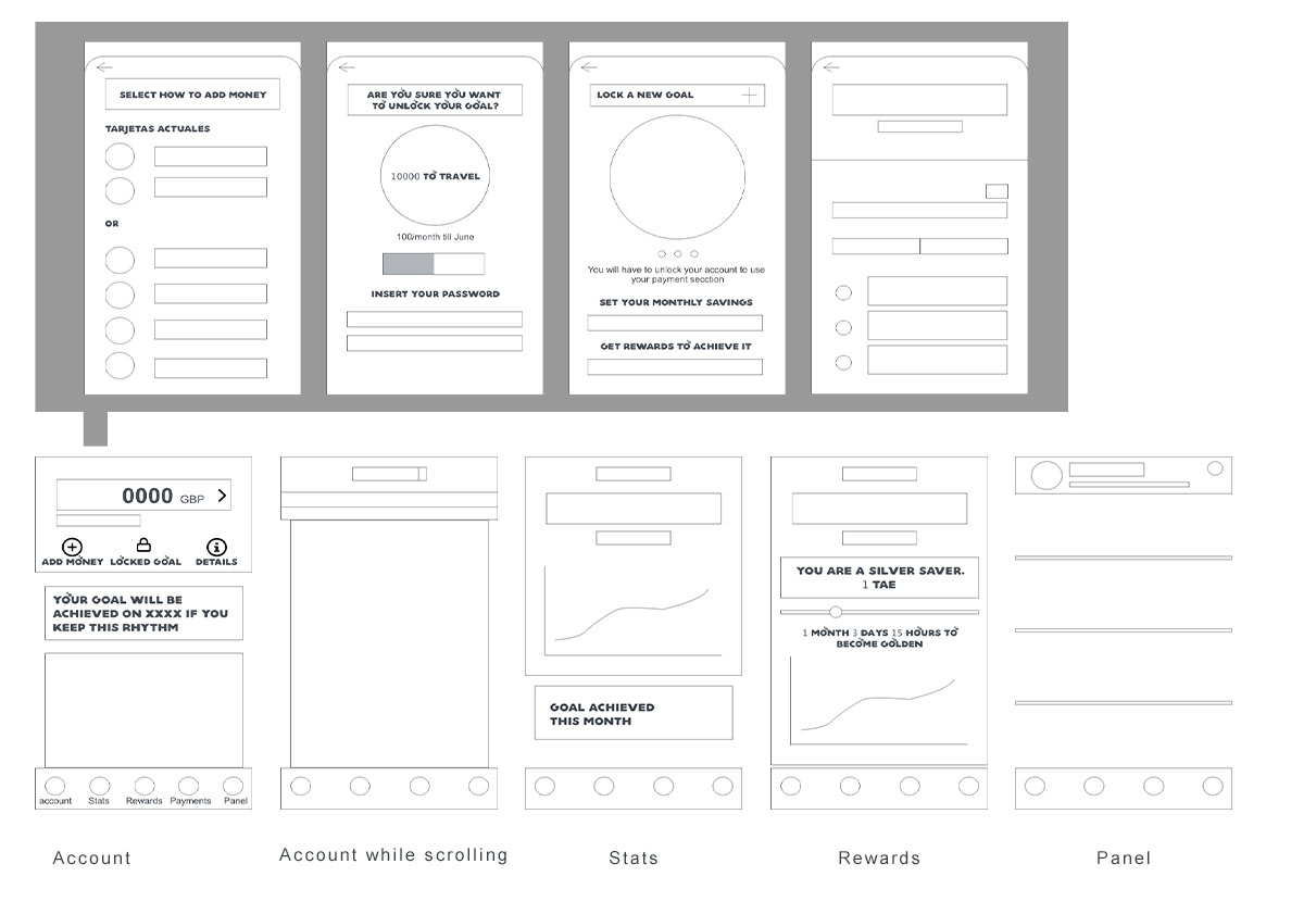
PROTOTYPES
MOOD BOARD
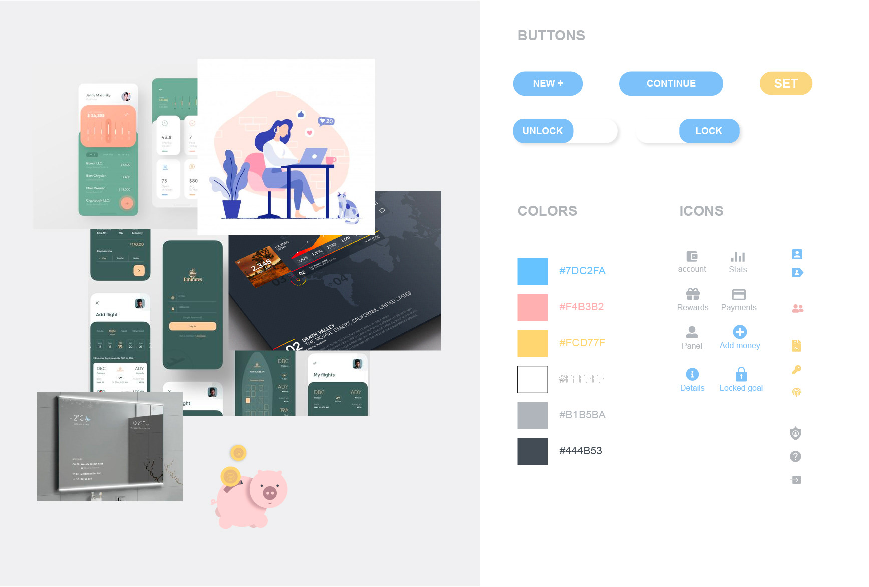
COLOR
The pink color it is associated with money and, as in this case with piggy banks. It remember us to our childhood when, this little pig was the safest place for our money. It transmit calm and stability.
Also, in terms of accessibility, with this dark grey background all my complementary colors make a nice contrast.
Contrast Ratio 8.83:1 - white on grey.
Contrast Ratio 5.02:1 - pink on grey.
Contrast Ratio 6.37:1 - Yellow on grey.
Contrast Ratio 4.61:1 - Blue on grey.
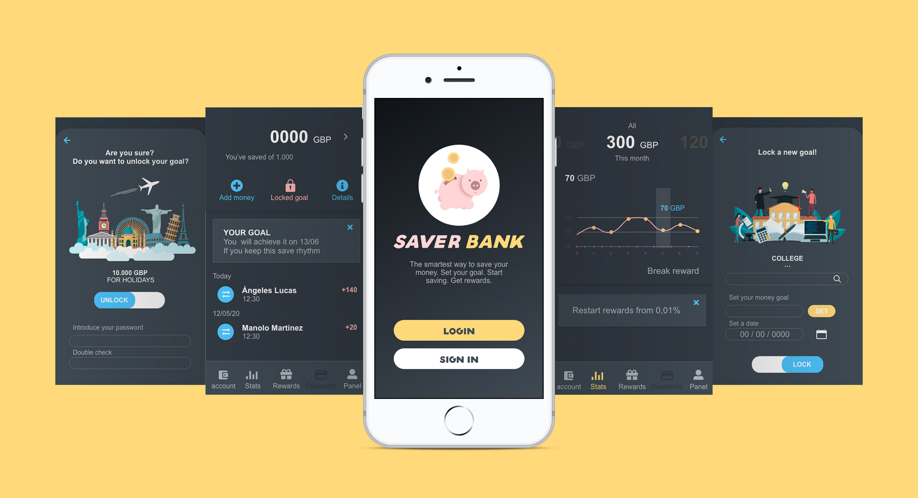
FINAL PRODUCT
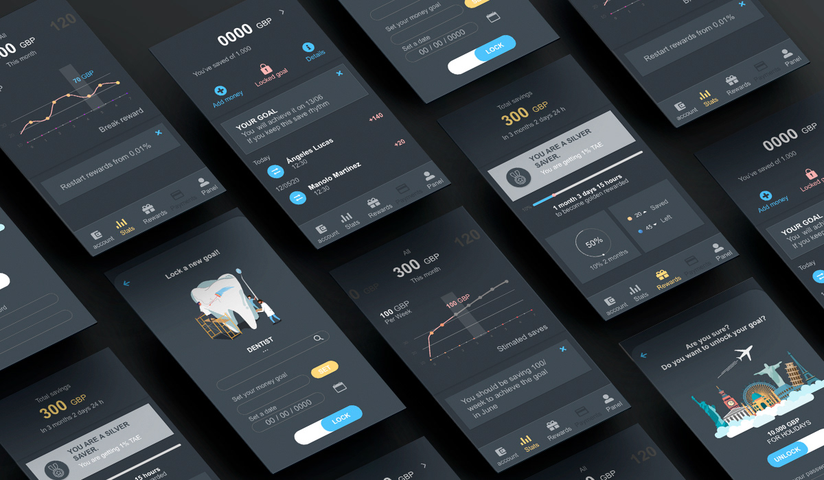
APP FLOW
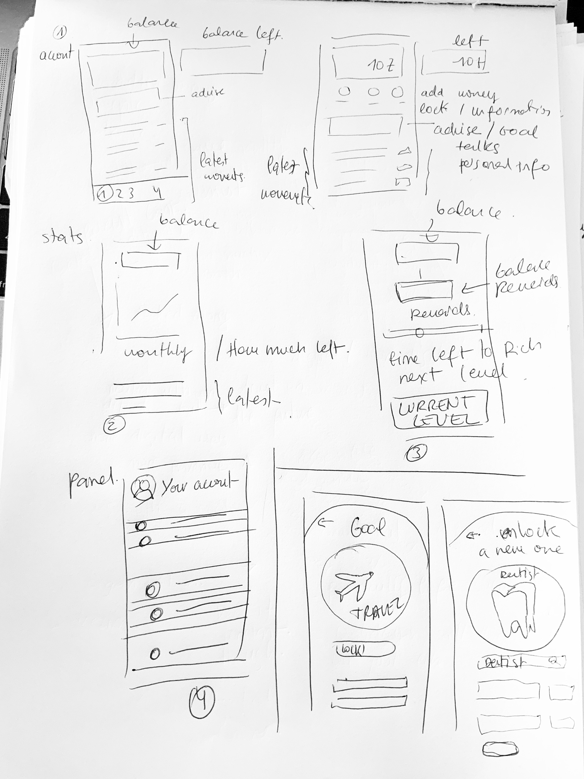
I designed a user flow based on the ideas I came up with on the design studio.
It works as a regular bank account but setting goals. Purely based on save. Once you lock your account you have to unlock it to do any movement on it.

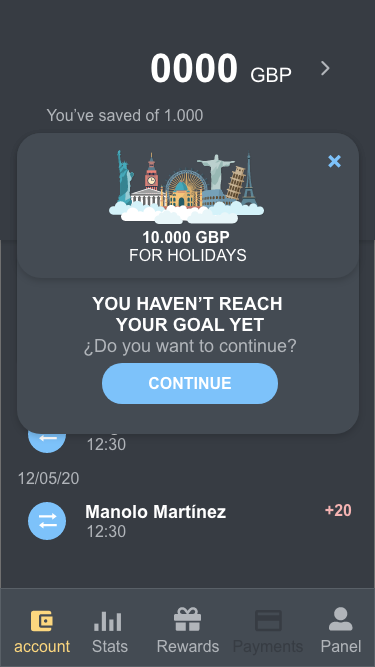
A/B TESTING
At this point, we wanted to know what works best to persuade the user not to unlock their account once it is locked.
When they lock their account, they start to generate interest so the longer they keep the money, the better. This is also better for the bank.
We wanted to know what is the better argument to convince the user:
- The rewards they are going to lose. That % of the interest they had to achieve.
- Show them the goal they couldn't complete.
We've been running the test for 20 days.
ANALYSIS OF A/B TEST
We found the results were not really representative to get any conclusion if we don't discern the targets. Once I did it I discover that:
- The higher amount of money and the length of using the app, the "A" text works the better.
I sat then, that if you are a silver or golden user, we will show up the "A" message. And the rest the "B" one.
SUMMARY
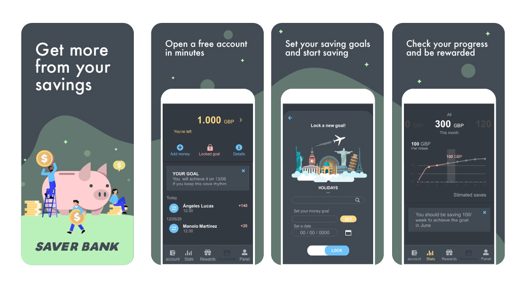
Saving Bank is an app dedicated to save. Get more from your savings. Open your account in minutes and start to saving without cards to distract you. With goals to achieve and % of interest increasing the longer you save, so you literally, get more for your effort. Open your own account for you or get more info for a Junior one.
LEARNINGS
· There are many different users but the key is to identify how their behavior is with the product, although they seem different most of the time they behave in a similar way.
. Define an open template while prototyping helps you to introduce changes when you need it.
. To set abstract concept goals before to start designing helps you out to develop a coherent design.