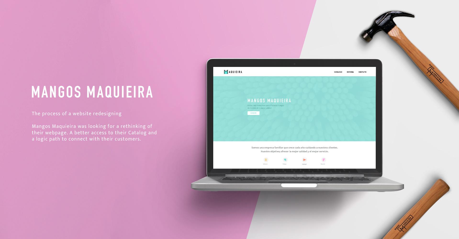
THE CLIENT
Mangos Maquieira is a factory that produces wood handles for tools. They were trying to update their website to be more visual and attractive.
THE OPPORTUNITY
Mangos Maquieira needed a web page redesign to engage with their clients. Mangos Maquieira is really well placed on the searchings for their sector. But they are struggling to show clearly they catalog and is a bit confusing the way they have to get in contact.
Is not an online shop
They refuse to set an online shop, although they know that around 40% of their new clients found them throw the web site. They started to feel they needed to have a stronger website as a platform for the new business.
¿How encourage the clients to get in contact without prices in the website?
¿How to improve the user experience setting a path to the Catalog and contact on their webpage?
THE SOLUTION
I developed a visual design for the landing page and reorganized the information and the way the catalog is shown, more as a shop like.
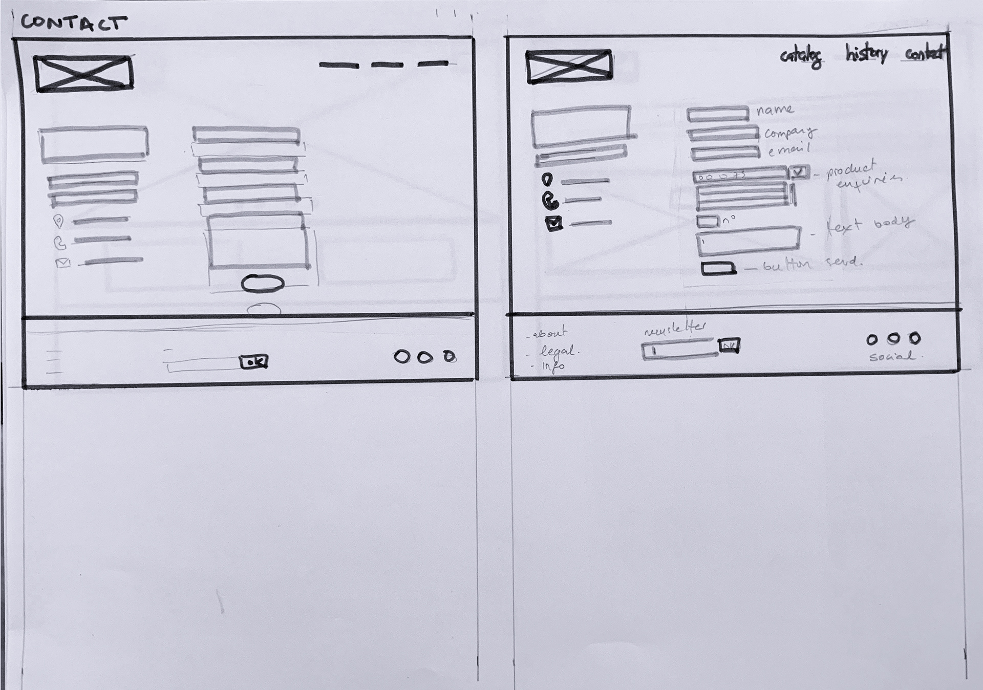
I also developed a complete inquires form, easier to search references numbers (auto filling them) this will help the clients to get in contact, based on our research findings.
MY ROLE
UX designer & UI designer
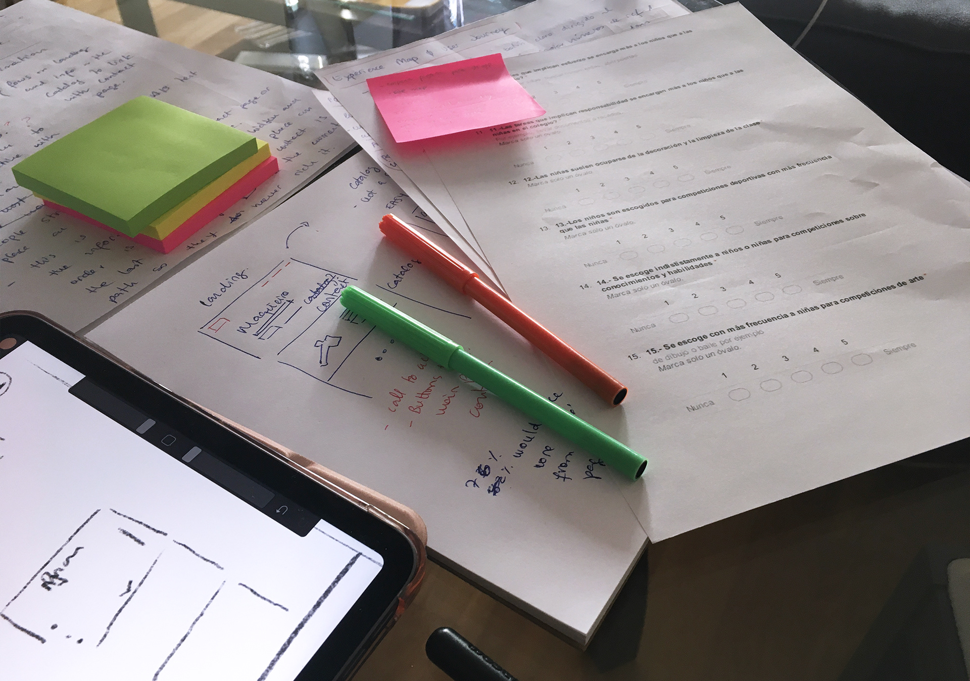
CONTEXTUAL SURVEYS & USER INTERVIEWS
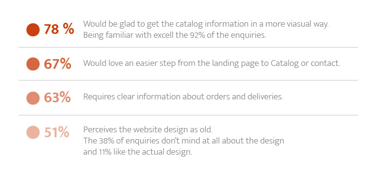
To start my research I decided to send inquiries to their clients, fortunately, they had a huge database. Setting some strategic questions about usability, what could help to or clients to place an order, get the information better, which is important for them, etc.
From that poll, I've been able to discern the target users and my goals to transform the webpage.
From that poll, I've been able to discern the target users and my goals to transform the webpage.
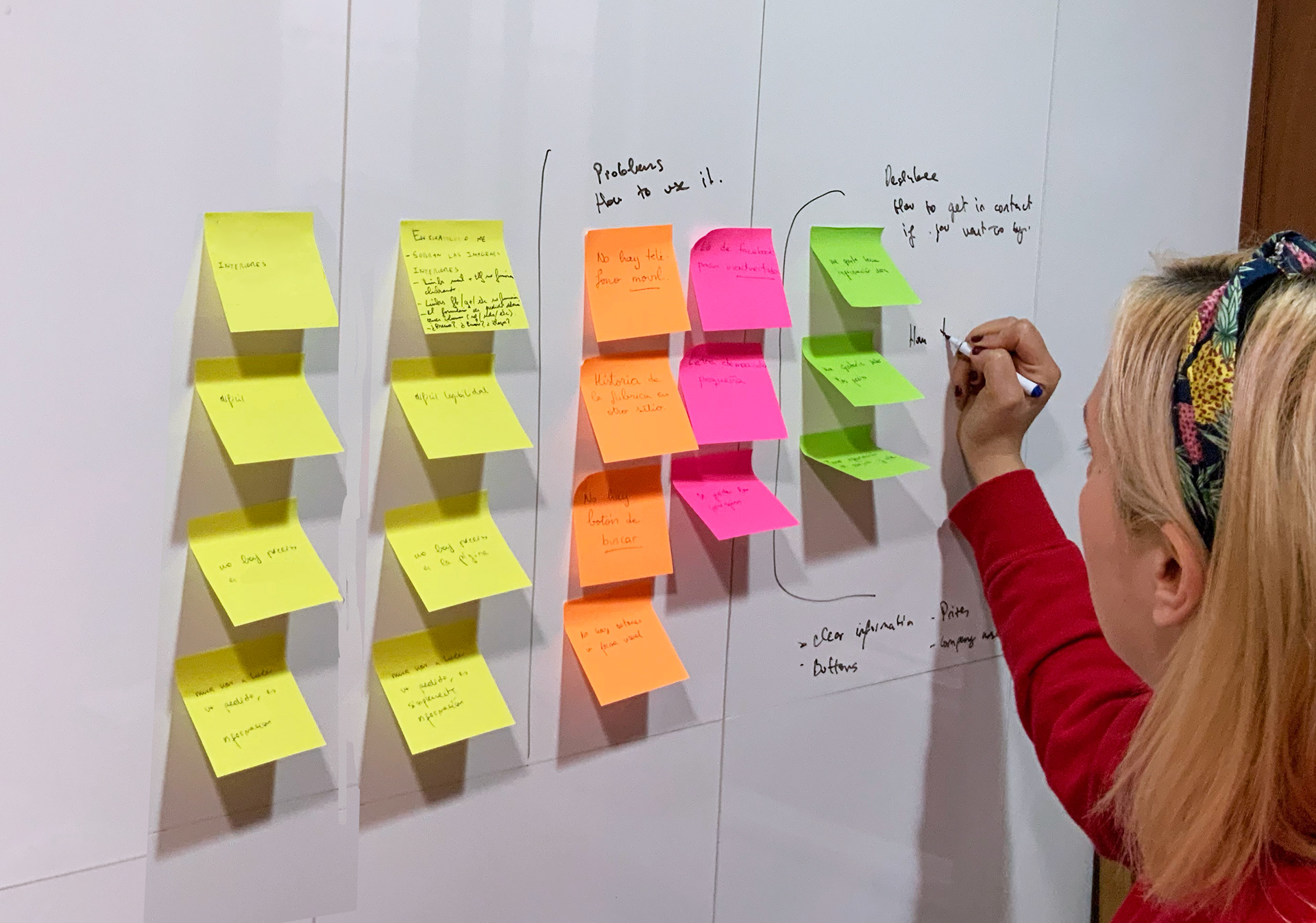
Experience map & User Journey
I was able to get the user journey and identify the less engagement and user experience problems on the website.
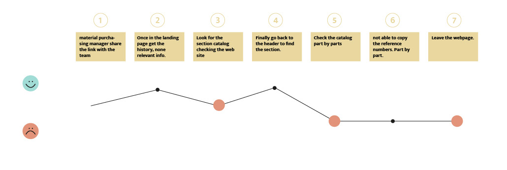
-The landing page doesn't drive you to the catalog or contact section. Not call to action or a clear path, but the header.
-The main information for the clients is hidden.
- The user has not clear the process to order or how the contact works.
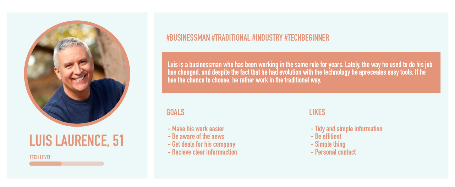
TARGET USERS
There are 2 different target users.
1- Very common in the industrial area, in offices. +45 years old who has a non-tech background and now had to get used to introducing tech daily at work. Still prefers the traditional ways to do it, but values the online information.
1- Very common in the industrial area, in offices. +45 years old who has a non-tech background and now had to get used to introducing tech daily at work. Still prefers the traditional ways to do it, but values the online information.
2- New era, young people who are seeking to completely transform the traditional industry world and modernize it. Glad to receive clear information and get rid of pure confuse tables format for all the information. Internet friends.
In this case, I define just a persona, after the research, I don't think the difference between targets is meaningful for our case.
PERSONA & SCENARIO
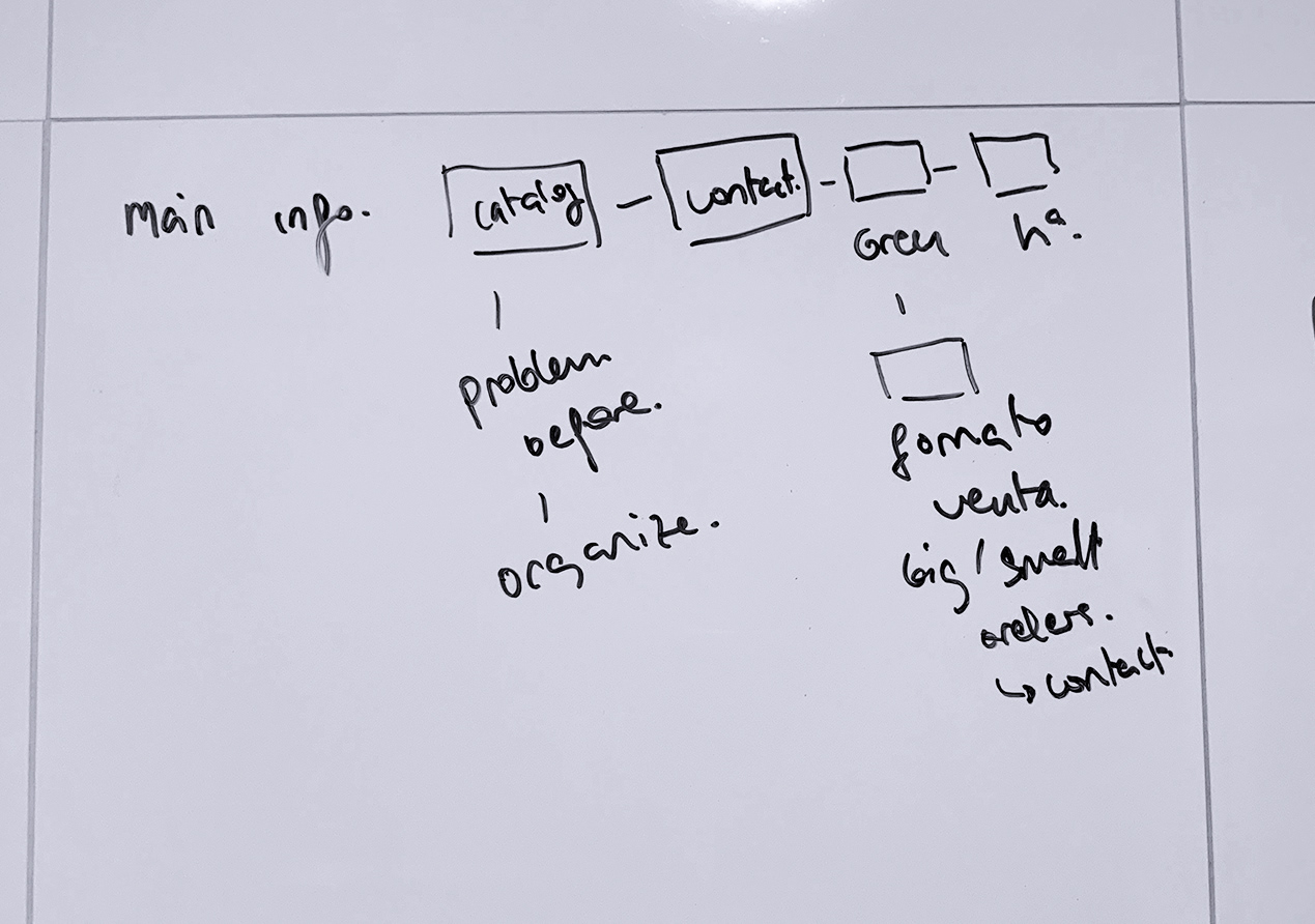
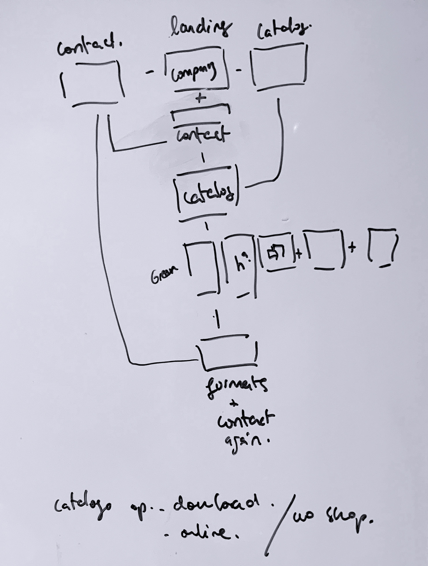
SITE MAP
I found a hierarchy for the website, designing a user path for them to reach the catalog and a bridge to get in contact with the company.

DESIGN STUDIO
I conducted a design studio focused on the following:
- Developing solutions for the HMW statements.
- Set a visual composition to help with the problems I found in the research.
- Making it easy and guide the user through the website.
A second design studio was conducted focusing on the ideas I came up with, in the first design studio. The main goal was to focus on how these features and ideas would be implemented visually on the website.
The following prototype was the one that responds the better to the client's needs.
The following prototype was the one that responds the better to the client's needs.
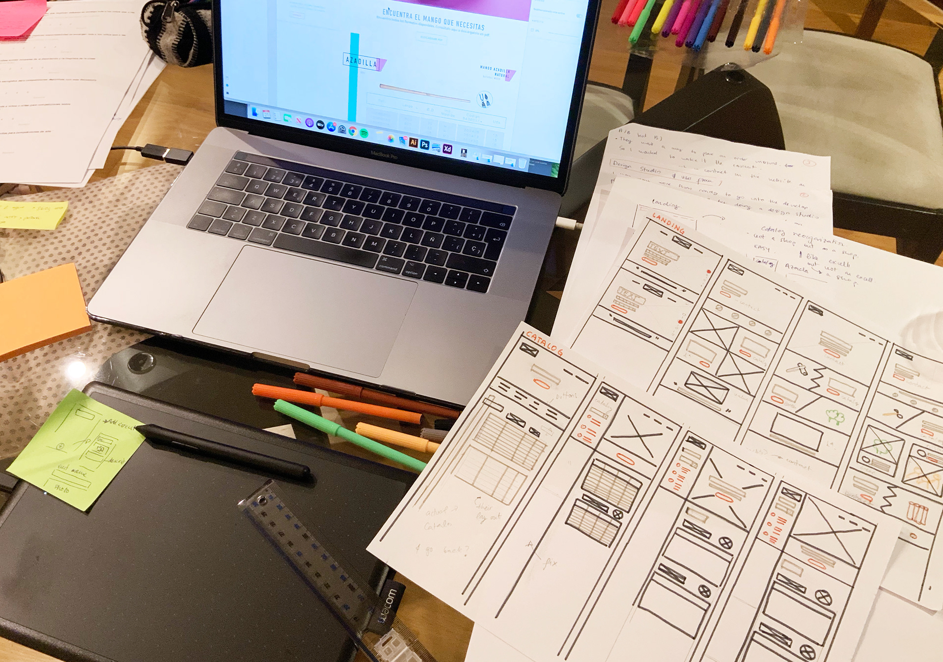
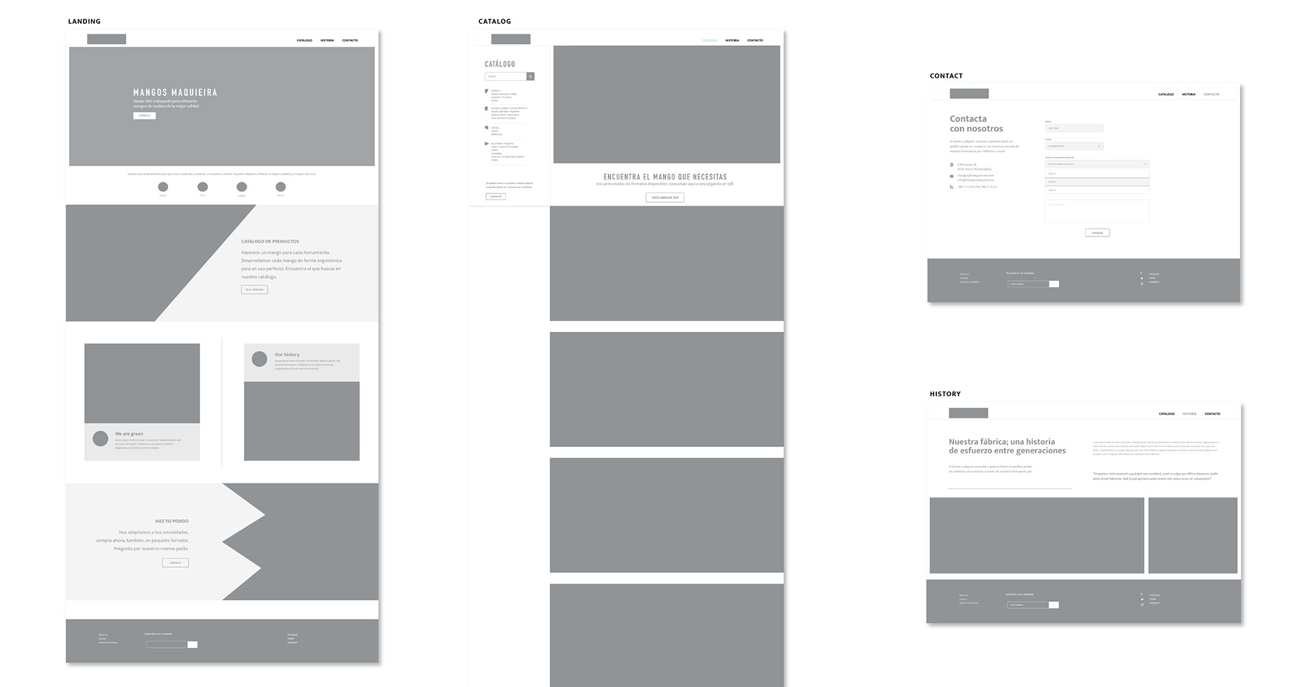
MID-FI PROTOTYPING
MOOD BOARD
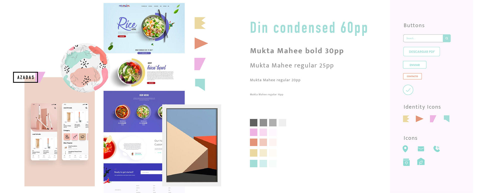
Mangos Maquieira uses the font Din Condensed, so I decided to use it on the website, changing for URW DIN, on Adobe Fonts. Clean and very clear to read on titles.
The brand guidelines use this font with and specific kerning. So to keep coherency with the guidelines I use it that way. But only in titles, because this issue makes it very hard to read on the body copy.
The brand guidelines use this font with and specific kerning. So to keep coherency with the guidelines I use it that way. But only in titles, because this issue makes it very hard to read on the body copy.
I used Mukta Mahee, bold and regular. For Subtitles and body copy. It is also in the Adobe Fonts catalog. This font is clear to read, neutral but with its own personality.
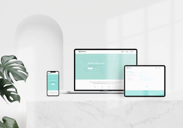
FINAL DESIGN
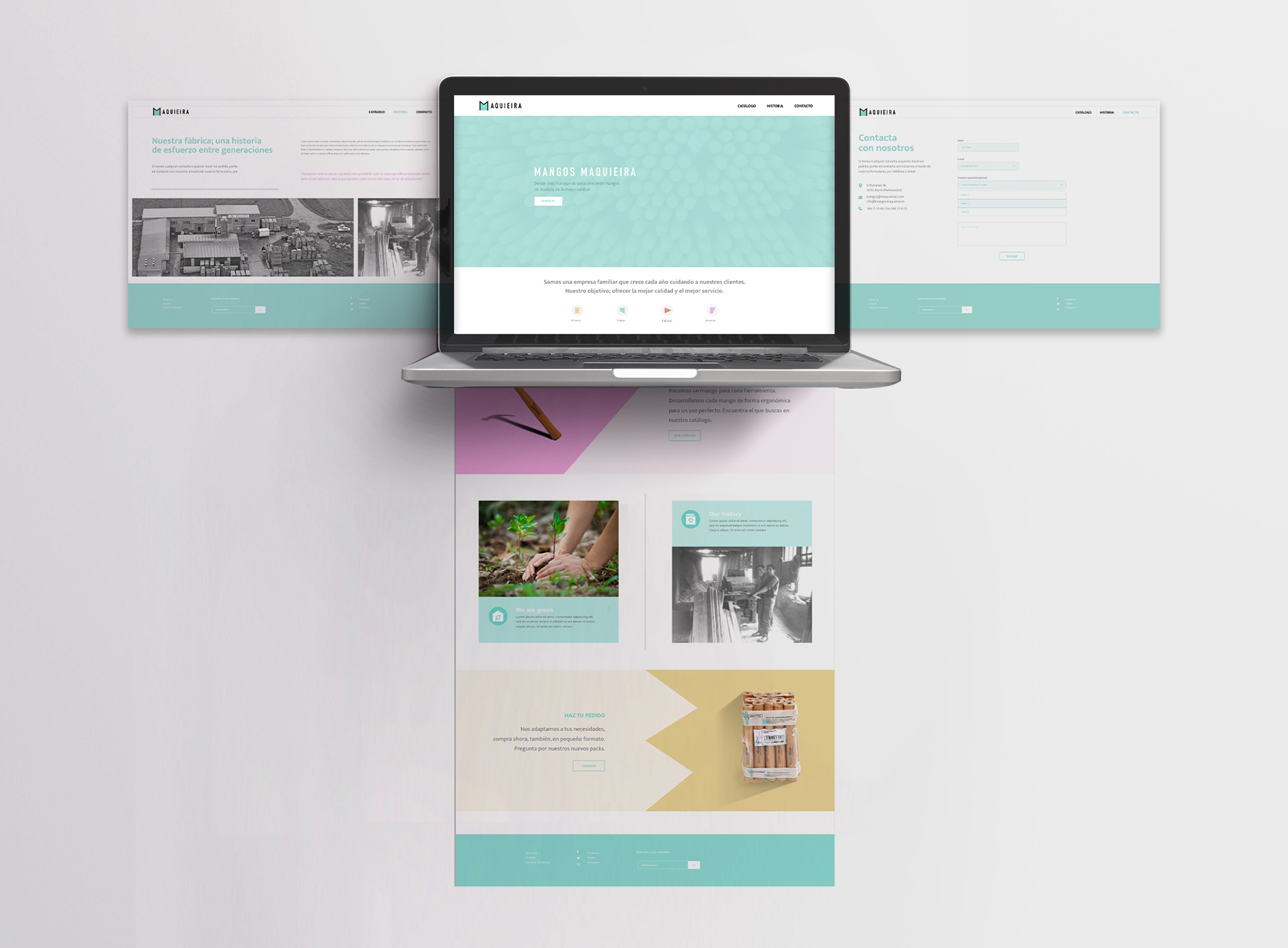
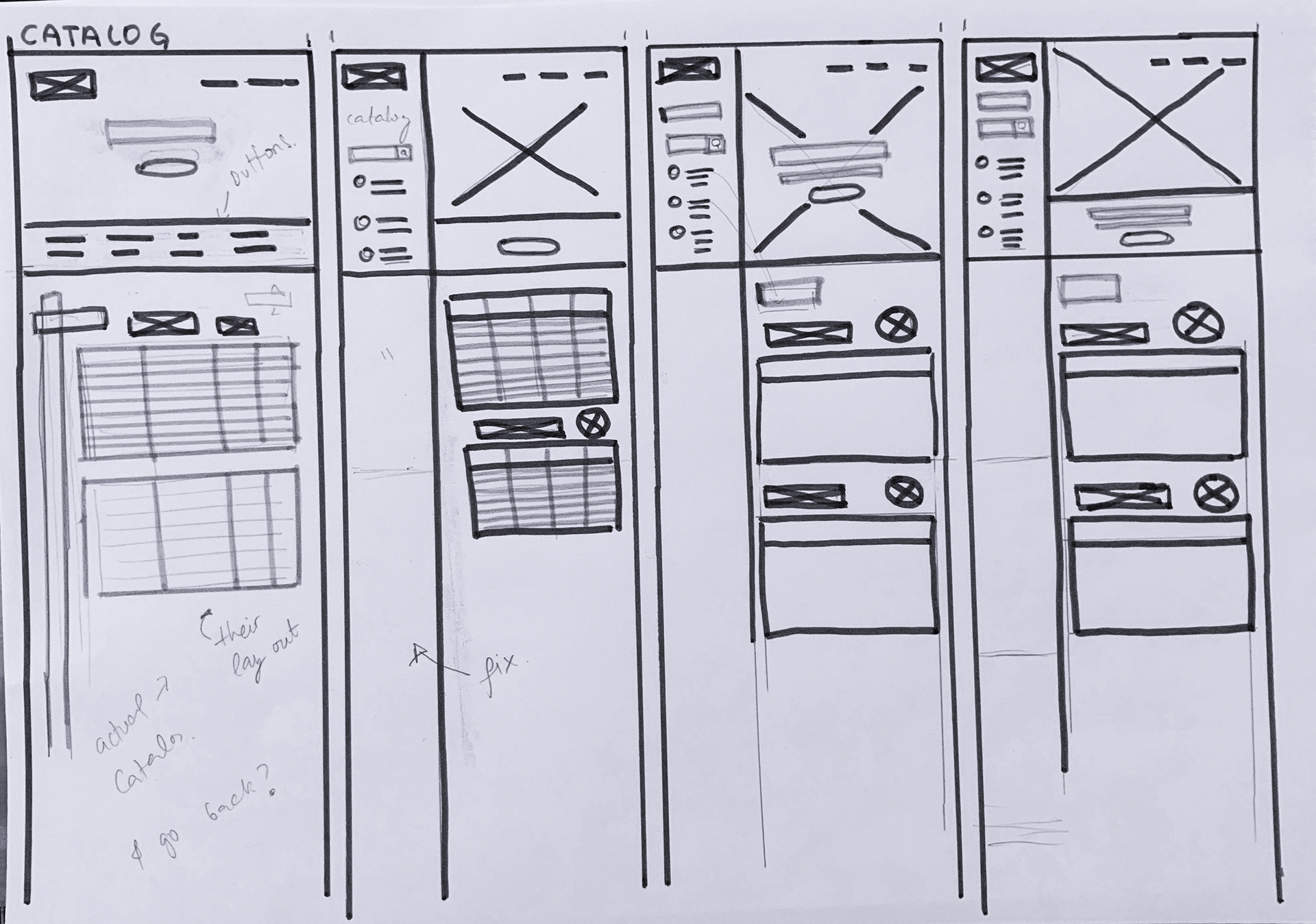
CATALOG
Despite they didn't want to set an online shop, I treated the product information as one. Setting a menu with categories and a searcher to rich the right product.
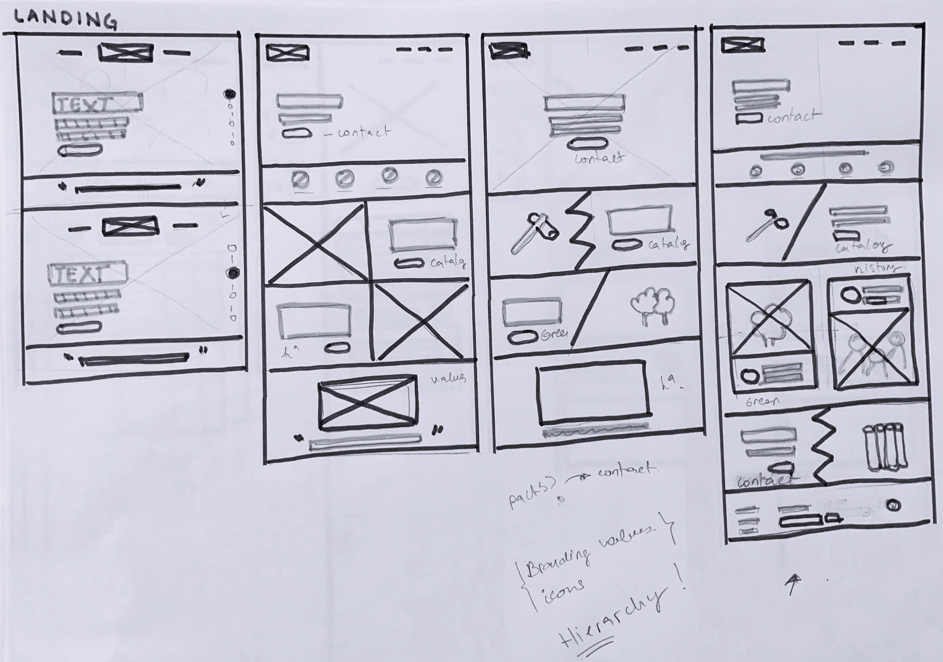
LANDING
I organized the landing page creating a path, through buttons and calls to actions. Organizing it by the hierarchy I found the best in my research.
SUMMARY
This was a project of a website redesigning, basically starting from scratch with new brand guidelines.
Despite they still wanted to work "as they always did" we updated the webpage to bring them to contemporary design with a nice flow and user experience. Finding the frustrations of the users and coming up with solutions.
In this case, I advised the client to build a "sign-in" part, where the client could check prizes or even receive private deals. It would help to find the website more accessible and like a tool to buy online rather than find any other way to realize the purchase.
The website is still on developed, now in back-end hands. So I'll wait for the feedback, to make further testings.
LEARNINGS
- The journey map is a must to identify the pain points before to design a new one.
- Identify the behavior of the target users through the interviews to define properly a persona. Don't be afraid to find something different from the initial hypothesis.
- Deal with the conclusions of your researches and also the client's opinions could be the opposite sometimes, but you have to find a way to advise the client and also make whatever they had decided.