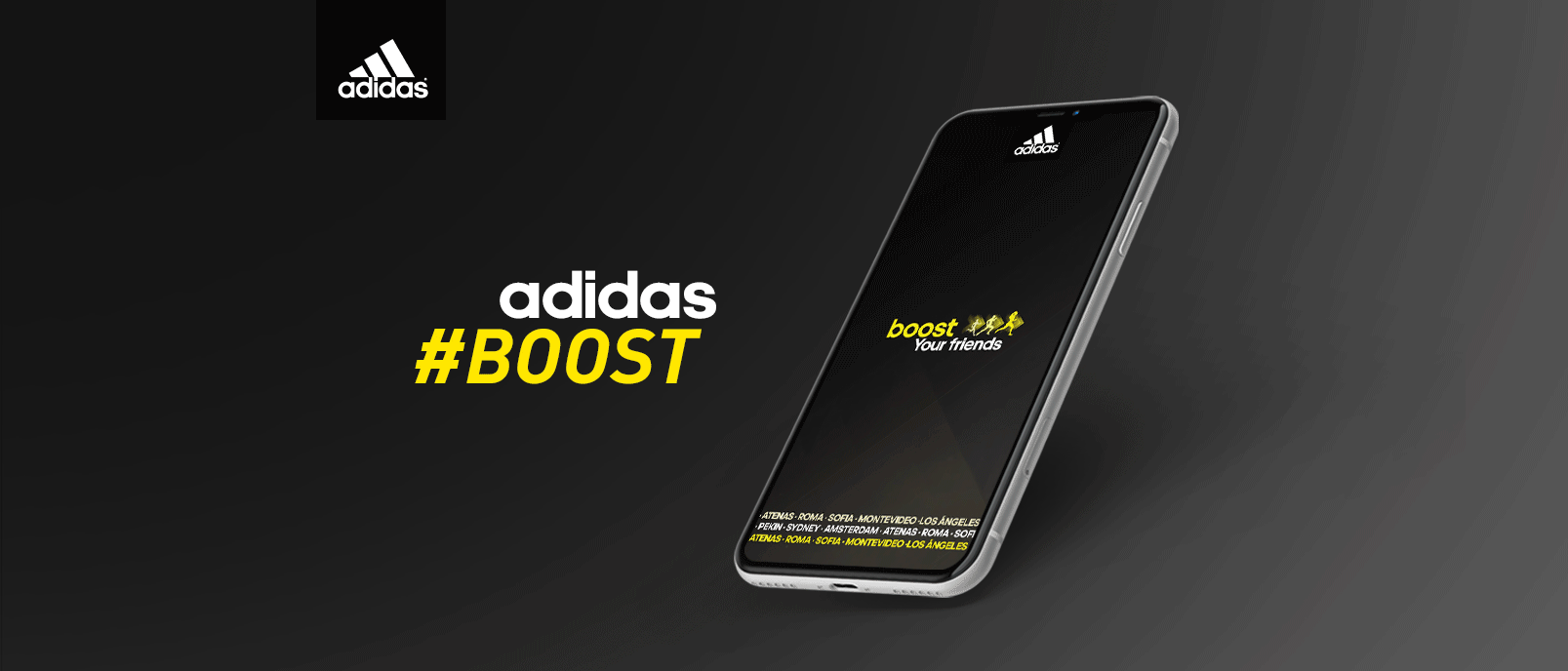
THE BRIEF
Adidas launched their new sneaker, Adidas Boost, and briefed the agency to create a new campaign.
They were looking for a promotional campaign to push the boundaries, showcase the new sneakers, whilst ensuring we engage with their target audience and build on their brand image.
THE CREATIVE SOLUTION
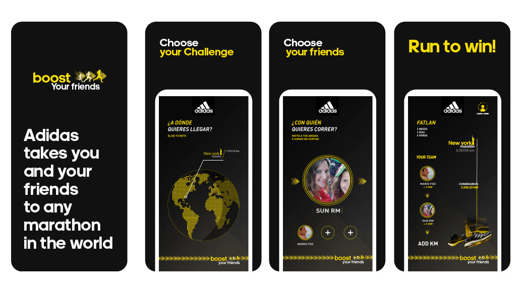
The new Adidas Boost sneakers, boost your step and drive you further.
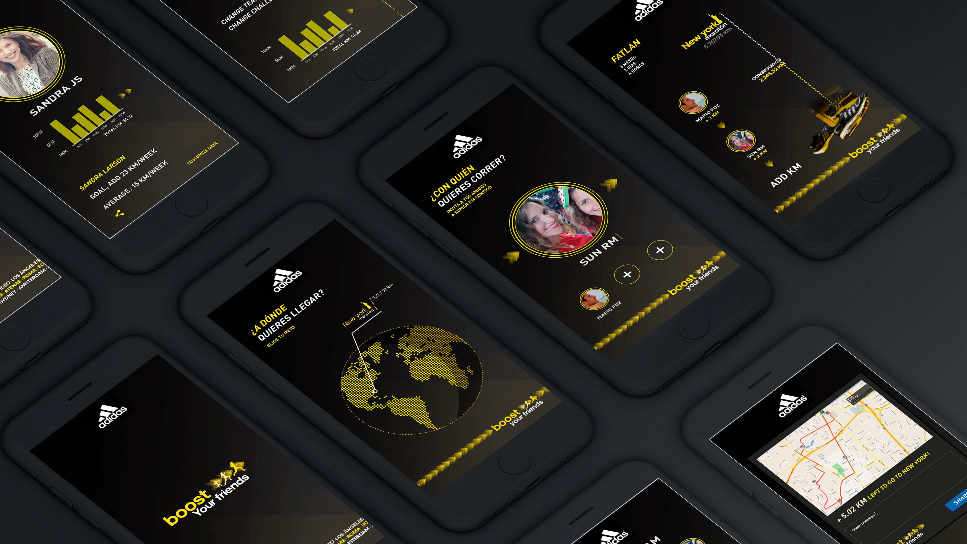
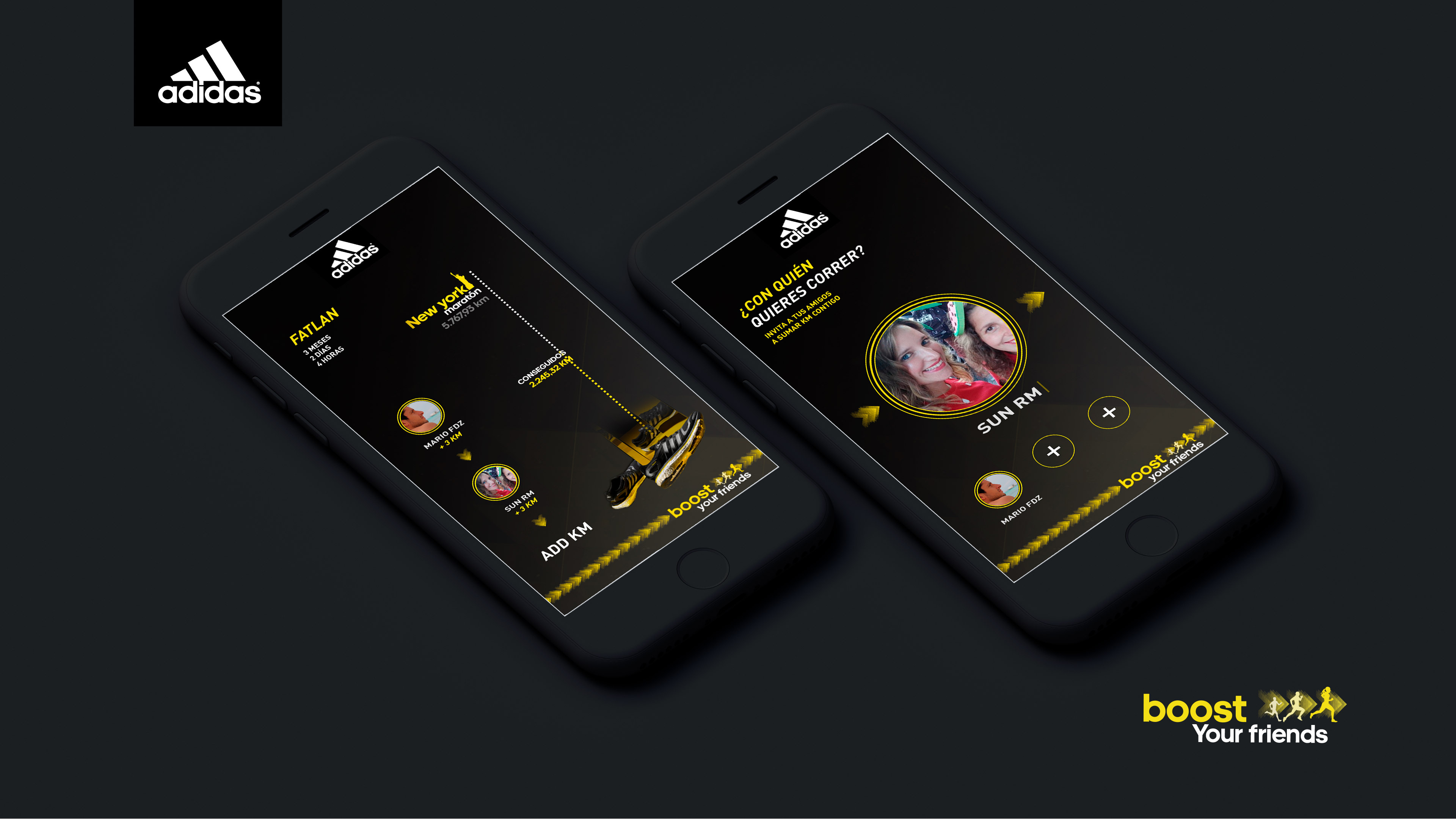
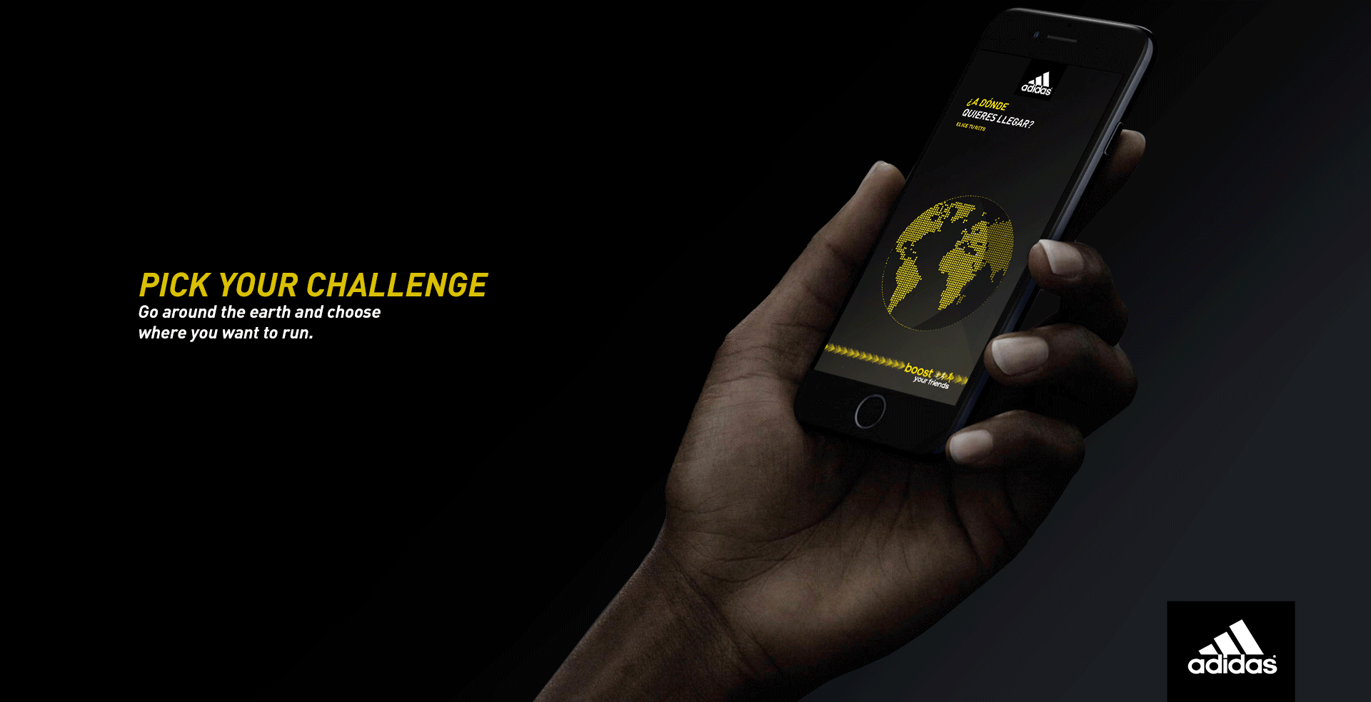
To this end, we created “Boost your friends”, a promotional action that takes you and your friends to any marathon in the world — the only condition is you have to run up to there.- Choose the marathon in the world you want to run.
- Choose the friends who you will run with.
- Start to run!
You and your friends will be the winners if you cover the distance between the marathon city and your hometown.

MY ROLE
- Creative Idea
- UX & UI designer
PROJECT SCOPE
Creative: - Conception, Ideation, design.
UX: - Persona creation, users story creation, scenario, Journey map, user flow, wireframes, testing.
UI: - Mood board, style guide, visual design, mock ups.
TARGET USERS
I made an hypothesis of my target to start my interviews.
INITIAL HYPOTHESIS
The product focuses on the reward, the challenge is key and there are elements in place to encourage the user to achieve their goals. The core target audience are people aged 20-40, but we are also keeping in-mind those aged 18 to 50. Whilst age is a factor we are focusing on sport lovers. We want to motivate users to go out every day challenge and push themselves.
So with this target and hypothesis I could start my interviews. And create an affinity map which could help me to define the target gains and pains for the project.

USERS FEEDBACK SUMMARY
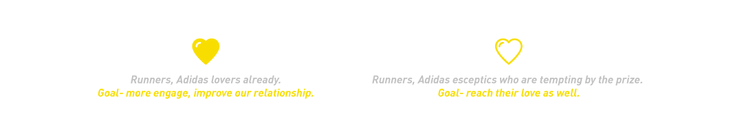
- Both targets found being challenged by the brand, interesting. The prize is worth pushing yourself to achieve.
- There was a concern about the timeframe in which they have to achieve the challenge, they were not sure if they should do it by themselves or with friends.
- Both show interest in the new sneakers and the new Adidas technology, more likely in the case of Adidas lovers.
ANALYSIS
-Most people who love to run, love challenges.
- Healthy people like to share it on social media (food, run, health trend habits)
- Serious runners dream about running in different marathons around the world.
- Their mindset: Challenging yourself is how you achieve your goals.
- A brand who encourages people to have fun, is challenging and stay healthy is a brand to love.
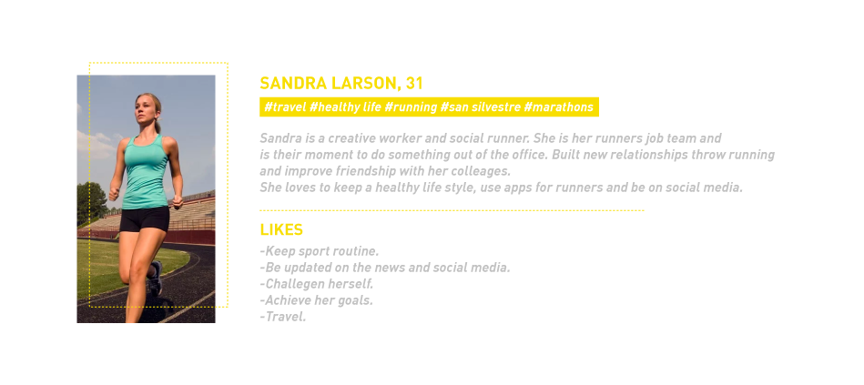
PERSONA & SCENARIO
I used our affinity map findings to create a persona and scenario in order to understand the issue from that perspective and therefore, focus better in enhancing the user Journey map.
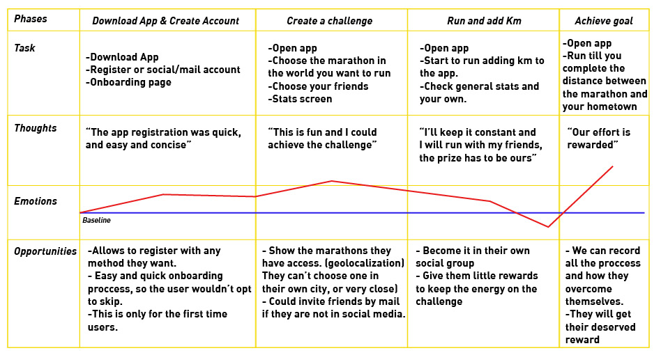
USER JOURNEY
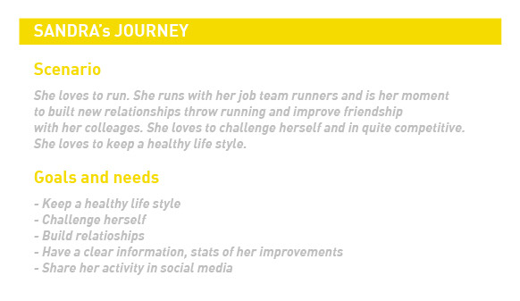
User journeys helps me visualize what my user's goals are, their motivations for using the app and their pain points while using the app.
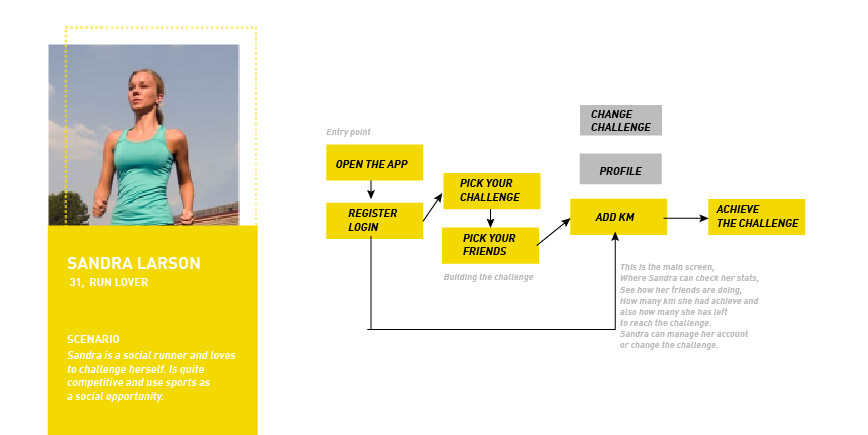
SITE MAP
Creating the initial designs of the app and testing with the user to analyze the pain points of the user for interactions

WIREFRAMES
I started a design studio to come up with my first wireframes.
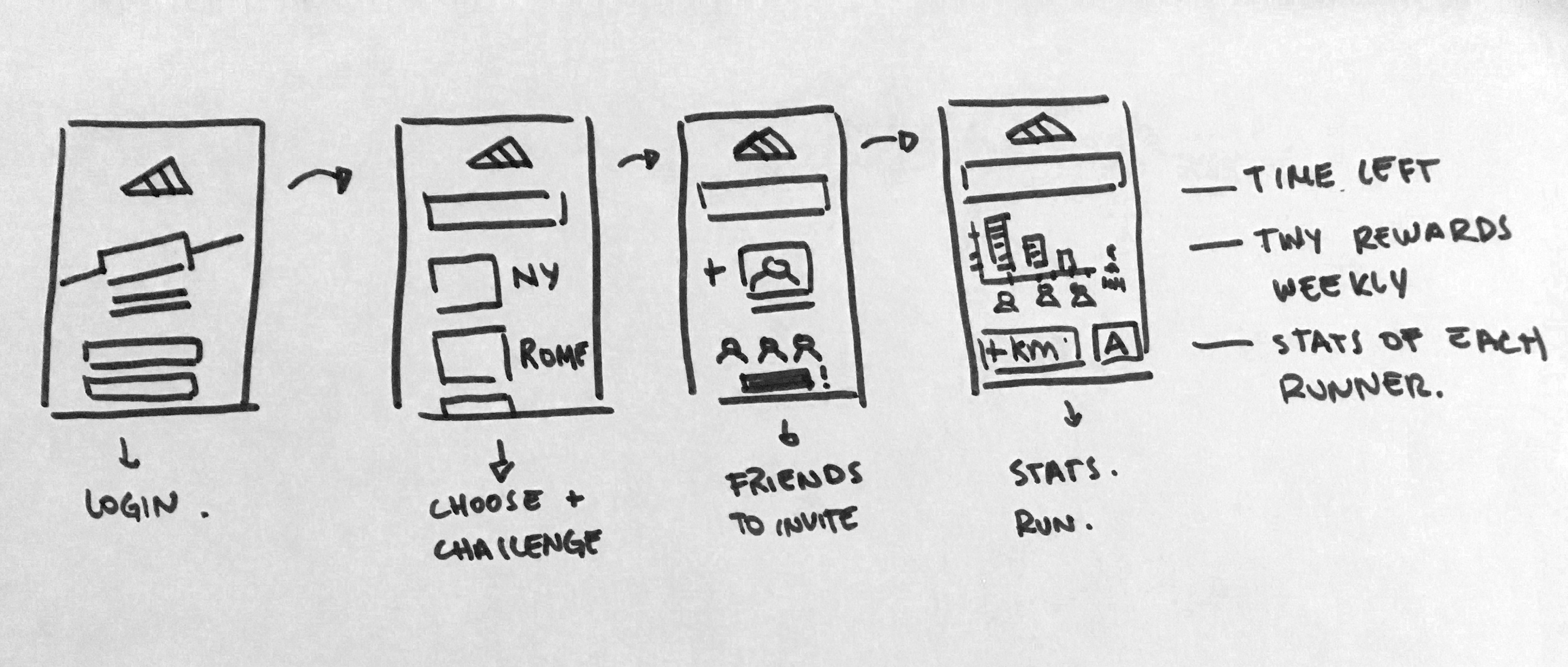
After checking the sitemap interactions I came up with wireframes to provide basic functionality, and information hierarchy.
USER TESTING
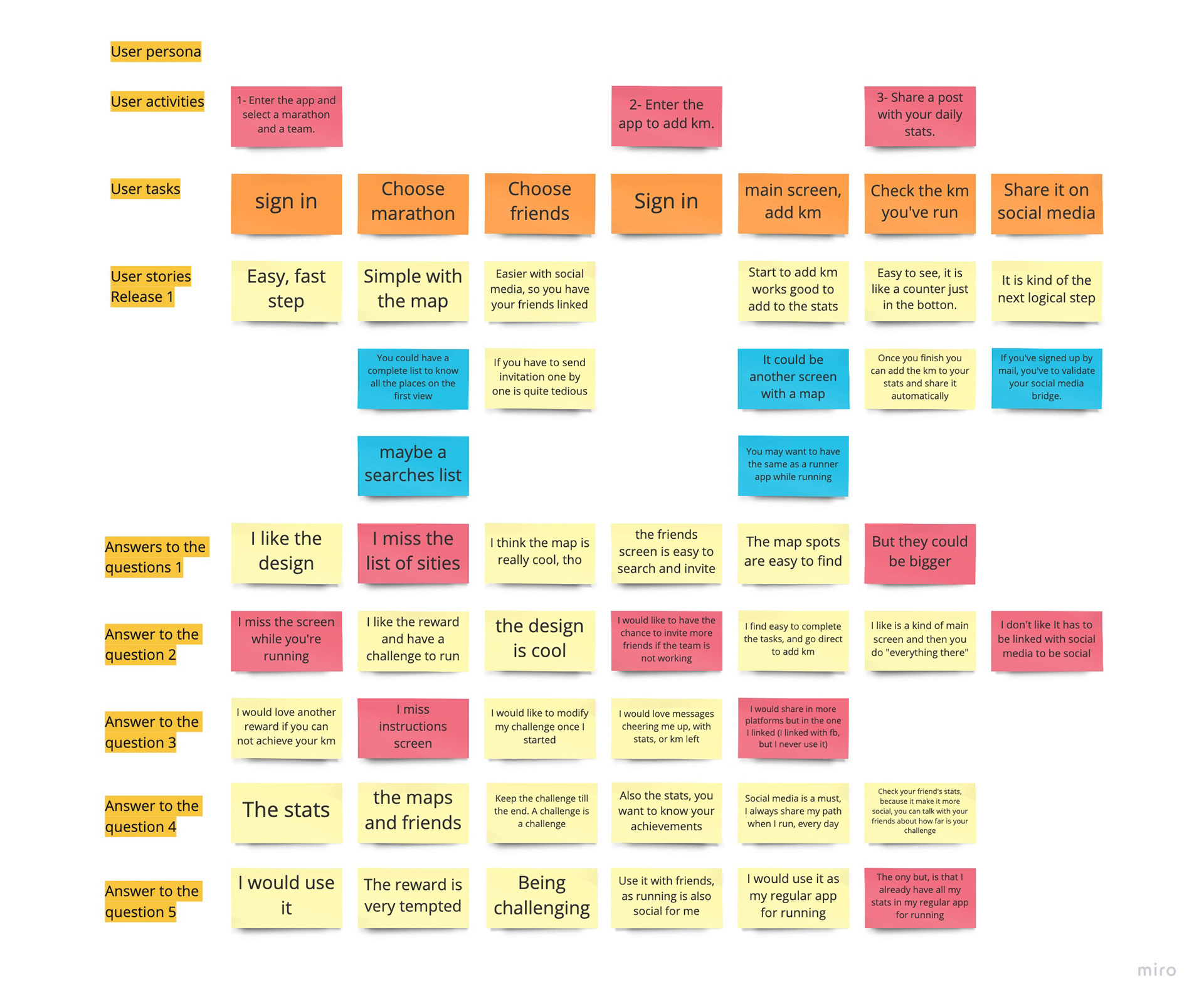
TEST SCRIPT
I started the test with direct tasks for the users and after doing the tasks, I asked them open-ended questions that would help me to understand them better and uncover more awareness on the things I may have overlooked.
Direct tasks:
1- Enter the app and select a marathon and a team.
2- Enter the app to add km.
3- Share a post with your daily stats.
Open-ended questions:
-What is your opinion of the selection screens, marathon and friends? What do you think about the map spots?
-Explore the app. Is there anything that you like/dislike?
-Would you suggest something to improve the experience? Do you miss anything?
-What features do you think are essential for this app?
-Would you actually use it? What could engage you the most?
ANALYSIS
After the user-testing, I have gathered a lot of data to sort out and analyze. After I made a list with the main pains I found between the users.
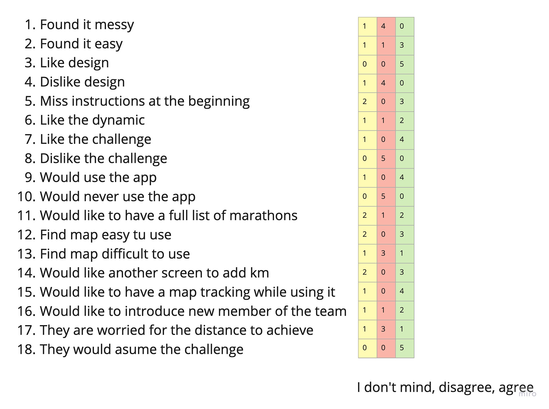
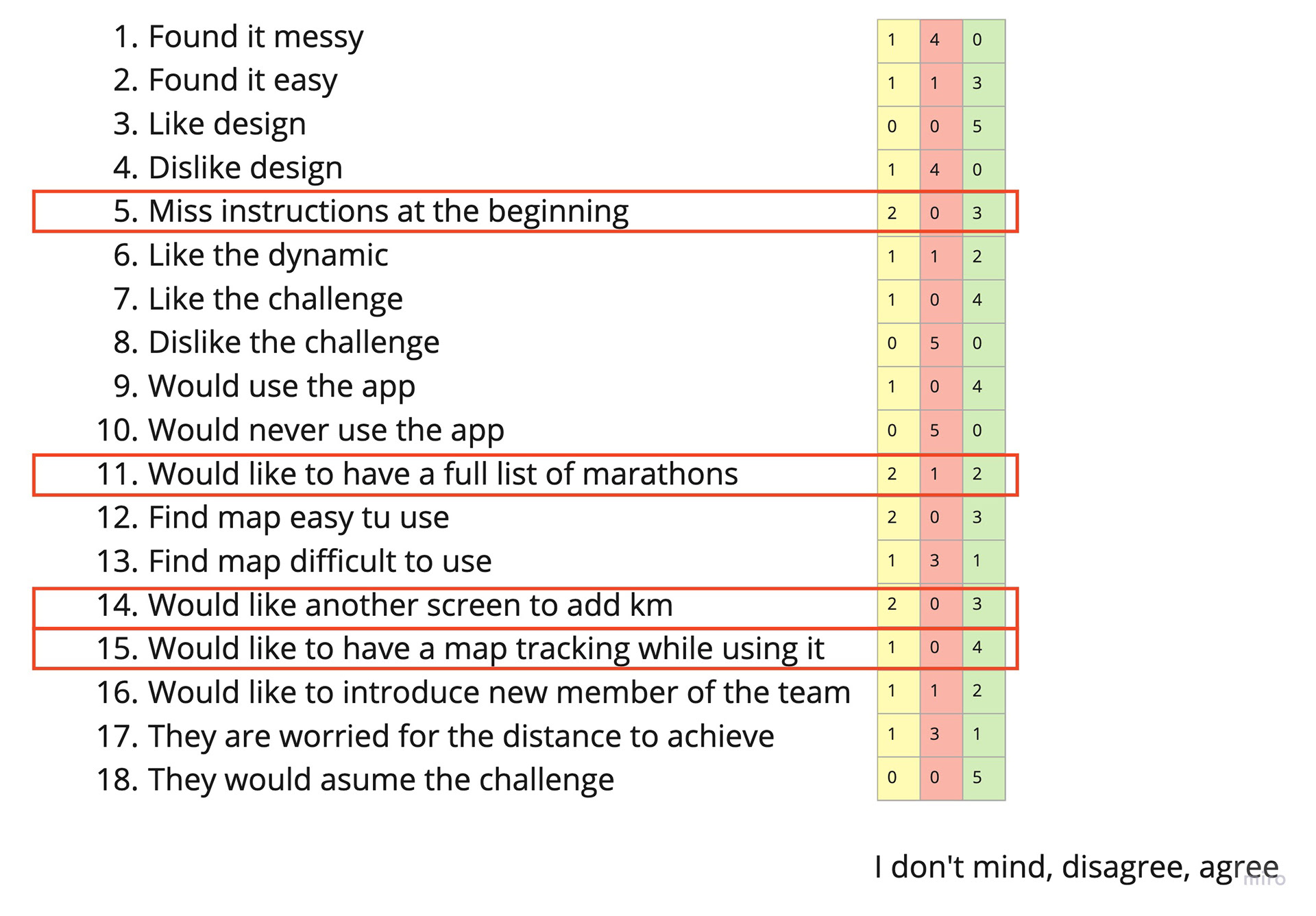
I identified the main problems to solve them.

ISSUE 1: Most of the participants are missing instructions at the beginning.
The solution: What I suggested was, right after the login or register, a video will appear explaining how to use the app.
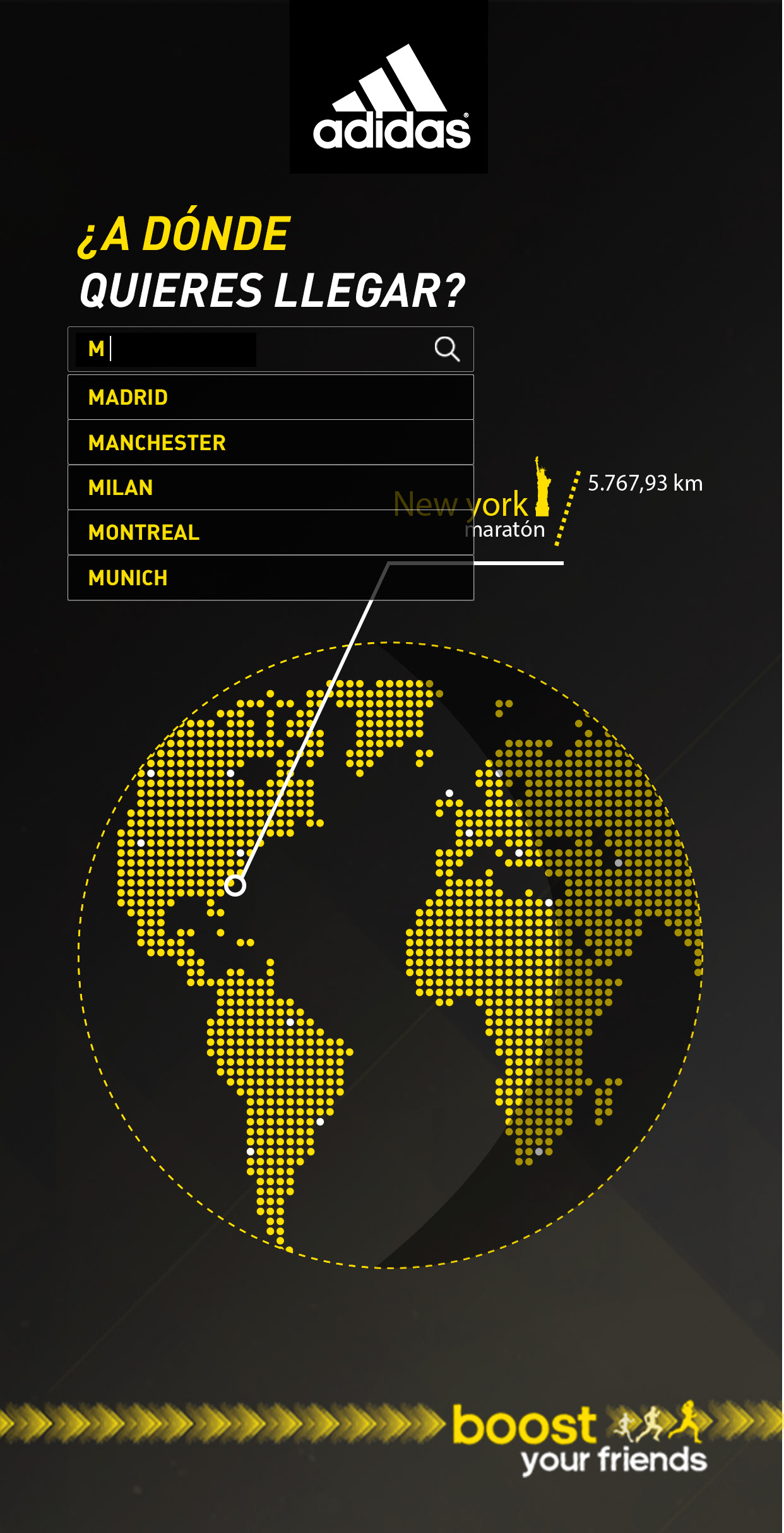
ISSUE 2: Most of participants despite the fact they liked the map design, are missing a full list with all the marathons in the promotion.
THE SOLUTION: I came up with a searcher, transforming the informative text in to a searcher box. A drop down list will appears as soon as you start searching.

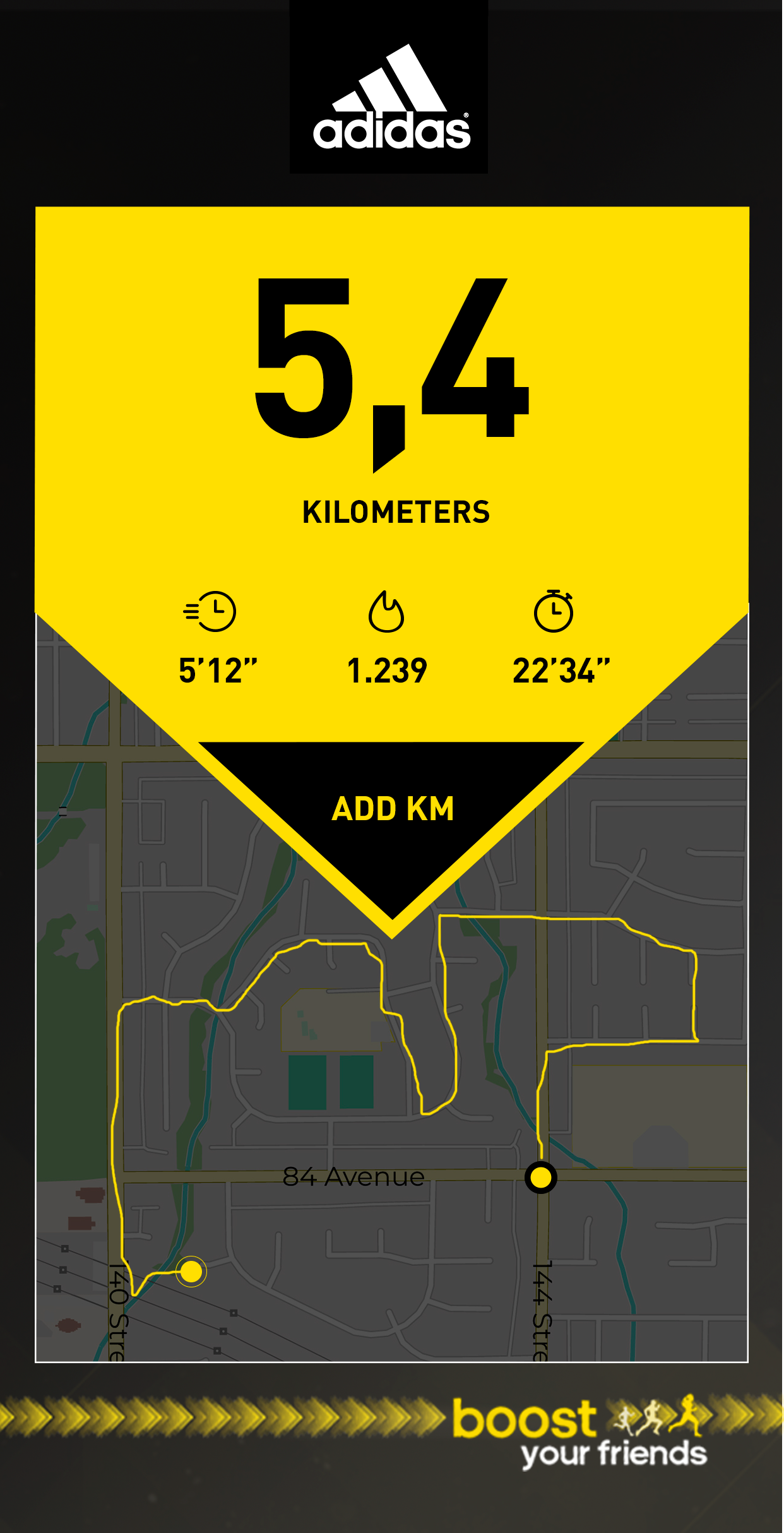
ISSUE 3: Main of participants were missing a tracking map and a clear screen while they were running. This issue was really important for them.
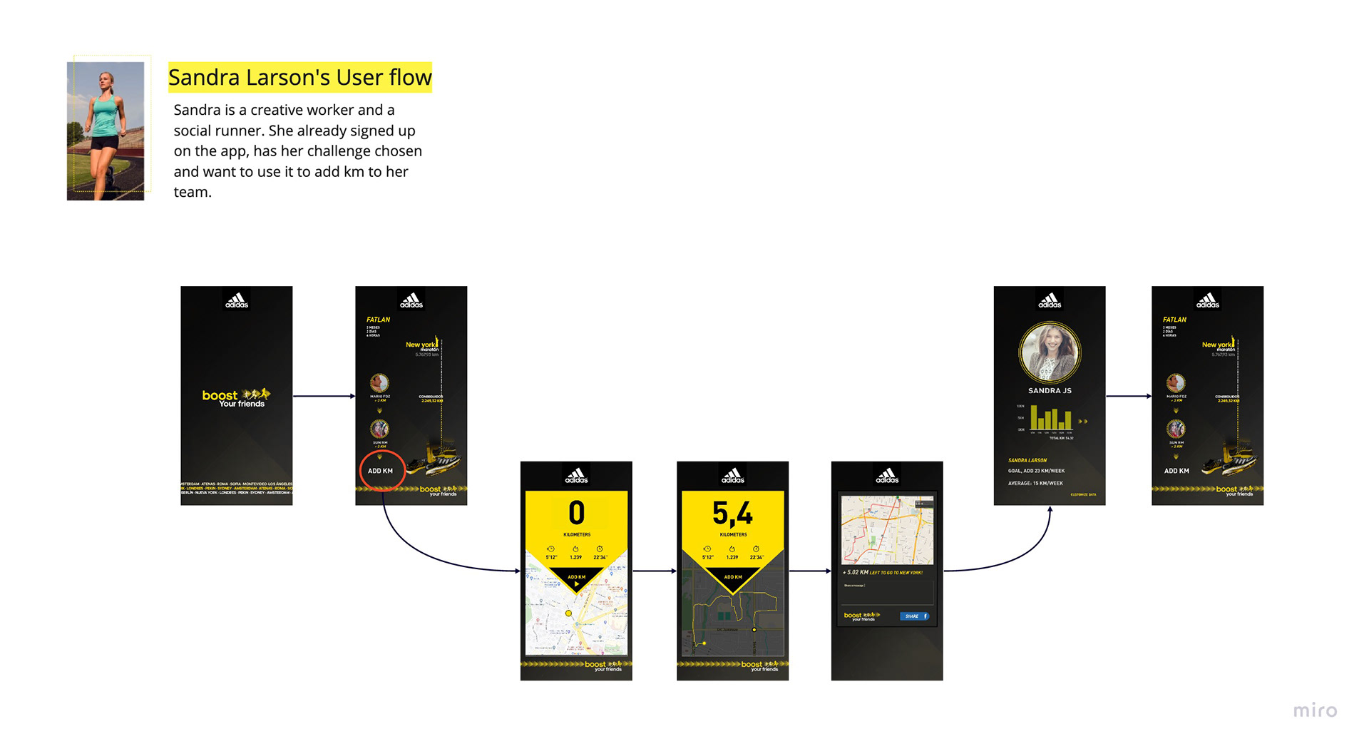
THE SOLUTION: My solution was to use the button "add km" (before, it started counting the km in the same screen) to drag them to another screen, with a map tracker and very clear stats.
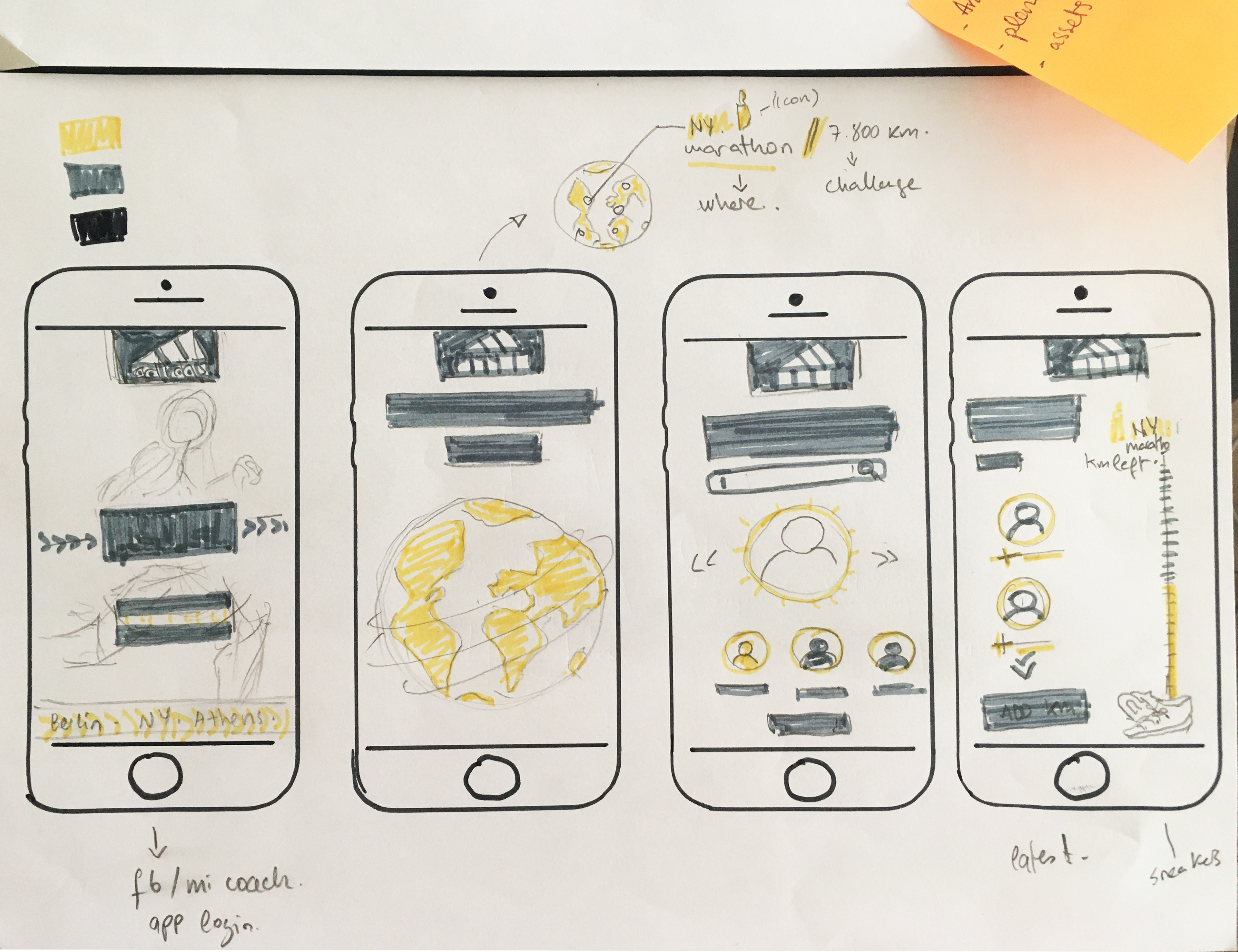
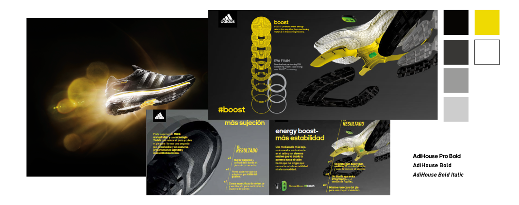
MOOD BOARD
I followed here the brand guide lines of the product and Adidas fonts. Also the colors worked perfect in terms of accessibility.
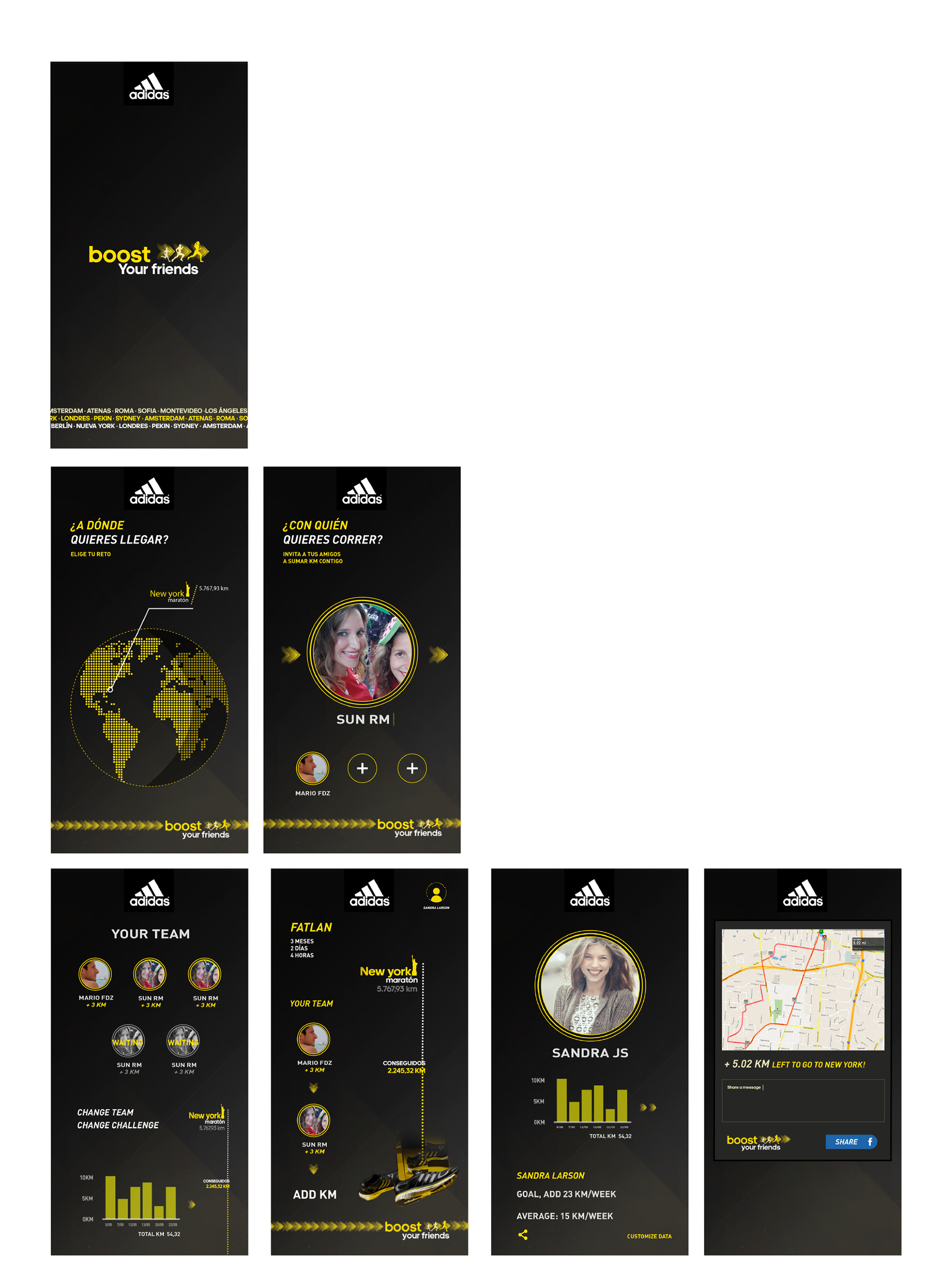
FINAL DESIGN AND MOCK UPS

This project was a challenge for me. I discovered how not to assume decisions as right from the beginning, learn from the real behavior of the user and questioning everything, to place the user always in the center, testing is the key.
- Come up with a full user journey map was really important, identifying which is the weakest point in the app and could go to the ideation part to solve it with creative solutions.
- To realize a test in the first steps of prototyping it is very useful to realize what is missing or what is working wrong. Have another point of view is a must.